CrystalClear.
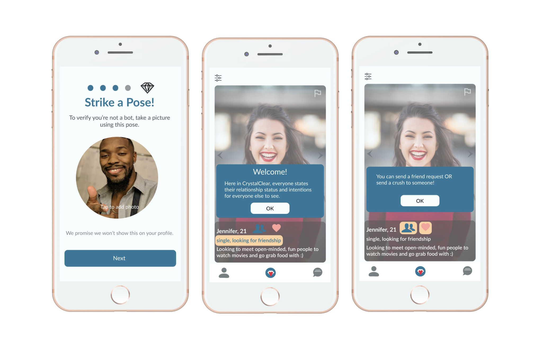
CrystalClear is a mobile social application connecting users with similar interests and intentions (friendships or dating), helping users create a crystal clear and transparent relationship from the get-go.
Background
The Apple store is populated with dating/social applications but few of these allow users to find friends and dates. Those that do either restrict friendships within the same gender or lack the necessary features allowing users to state what they are looking for.
As a sole UI/UX designer and researcher, I wanted to see whether lack of connections over similar relationship intentions was a serious frustration to users and if so, use this opportunity to research and design an app that would help resolve this frustration.
Research
In the span of four weeks, I conducted my initial research with a survey that I distributed through Facebook groups and applications such as Tinder, Bumble, Hinge, MeetMe, Patook, and Friender.
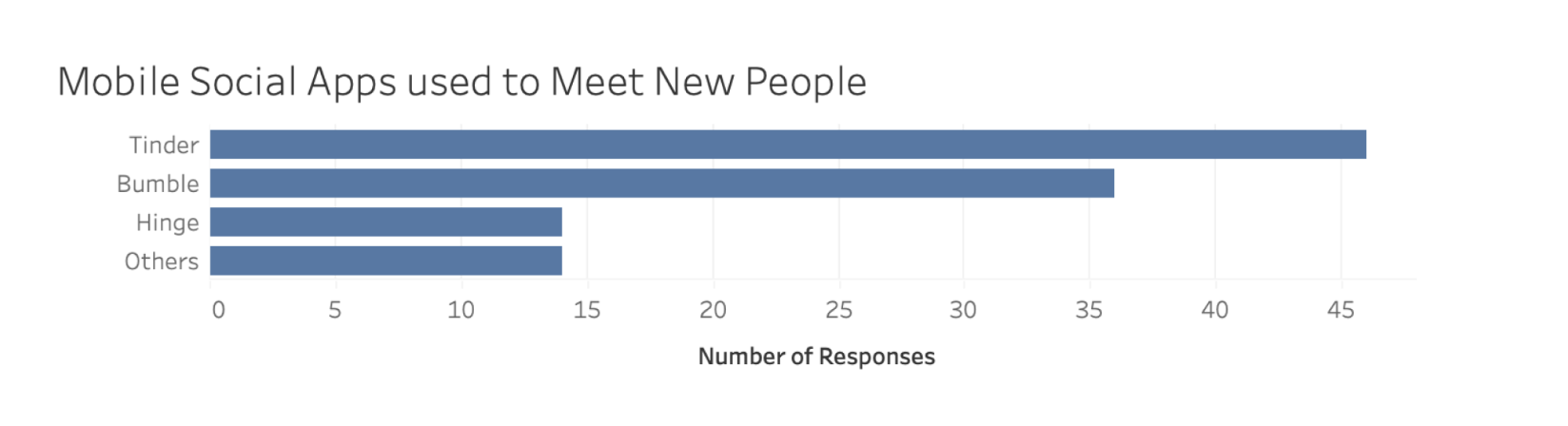
The surveyed population was roughly half male, half female and mostly between the ages of 19-26 (Average age was 24). Most of the users were on the popular dating applications Tinder, Hinge, and Bumble.
Apart from demographic questions, I asked users questions such as:
• What are your goals when using these applications?
• How do you use the mobile application?
• What are your biggest challenges when using the application?
This would help me gain a better overview of the population of users on dating/social applications and learn about some of the frustrations they currently come across.
User Goals
After gathering user insights, I organized the data into an affinity diagram to help me group relevant information together.
With this, I learned that:
• Users have many different goals on social/dating application which include finding a long-term partner, friends, casual dates, or just meeting new people.
• Their main tasks consist of finding people and messaging those they match with and they enjoy meeting people they have met online.
Frustrations and Pain Points
There were several pain points but the most common frustration among users was
Not being matched with the people they’d like to
This includes users
• Looking for a friendship and matching with others looking for a relationship and vice versa
• Matching with bots/scammers
User Persons
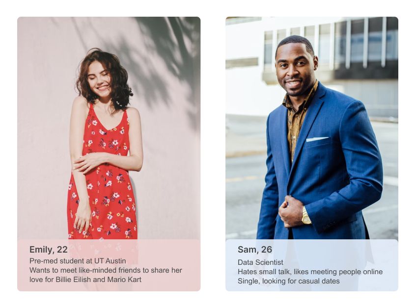
From the insights gained from the survey, I created two user personas as a representative of the surveyed population.
Problem Statement
It’s difficult for young people to form real connections on dating/social applications. Challenges that prevent them from doing so include not being matched with people having similar relationship intentions as they are (friendship/dating) or matching with fake users.
User Preferences
51% of users surveyed were either looking for a long-term partner, a friend, or both. Thus, I decided to focus on these two popular user goals when using social/dating apps.
To understand what information users would be posting about themselves. I asked users from the target audience to rate preferences like age, gender, location, looks, relationship status and more depending on whether they are looking for dates or friends.
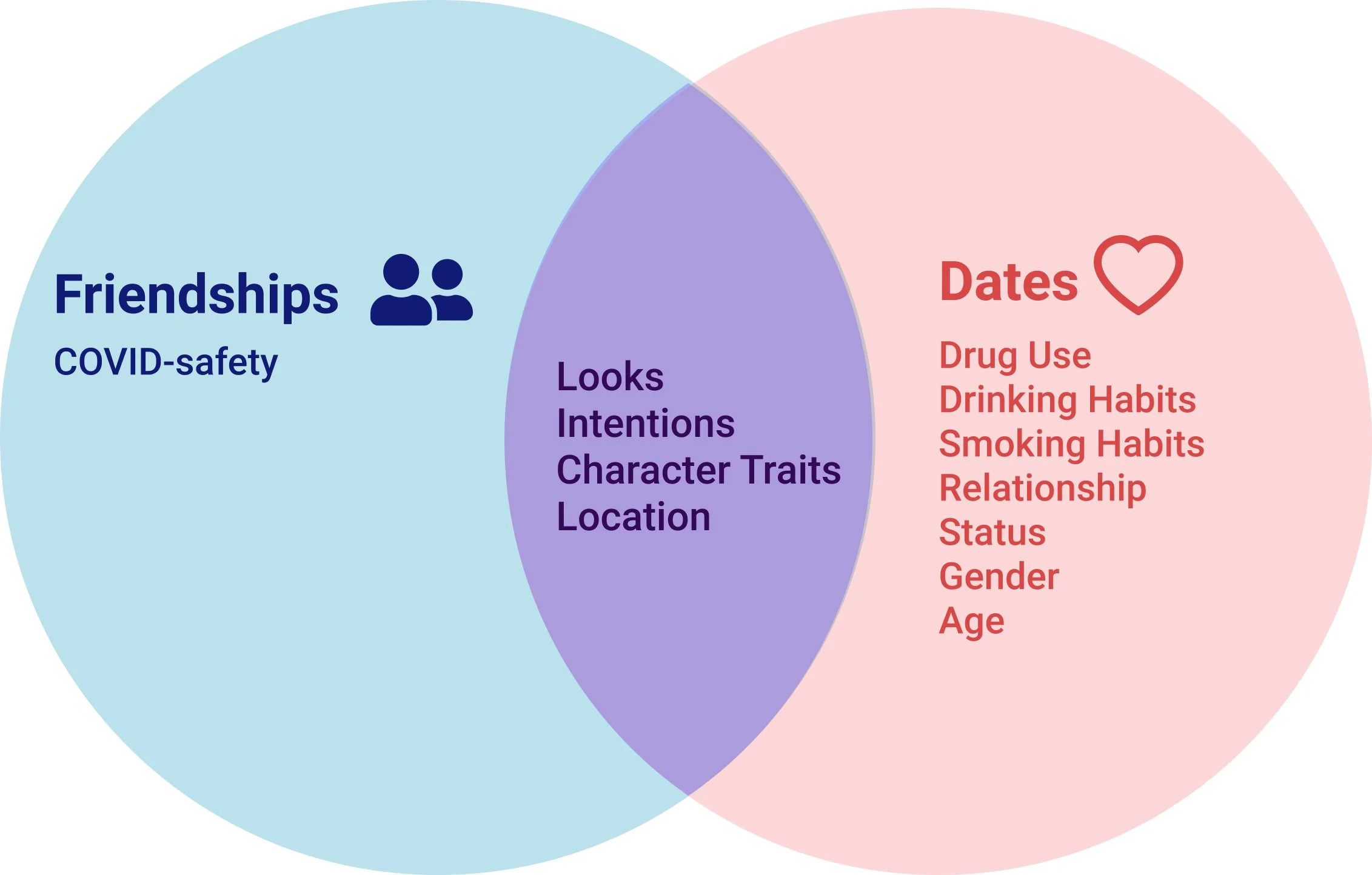
Looks, intentions, character traits, and location were important in the search of both. Thus, users would have a profile with their photo, relationship intentions, character traits, and their location available for others to see.
Critical Features
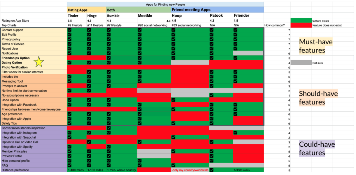
I organized dating/social applications by whether they allow users to find friends, relationships, or both and researched the common features they had. Common features would be included in the application.
To resolve the issue of not finding people based on different relationship intentions, the application would allow users to either match as dates or as friends.
Users would be photo verified during the onboarding process to reduce the number of bots and scammers.
Organization: Information Architecture
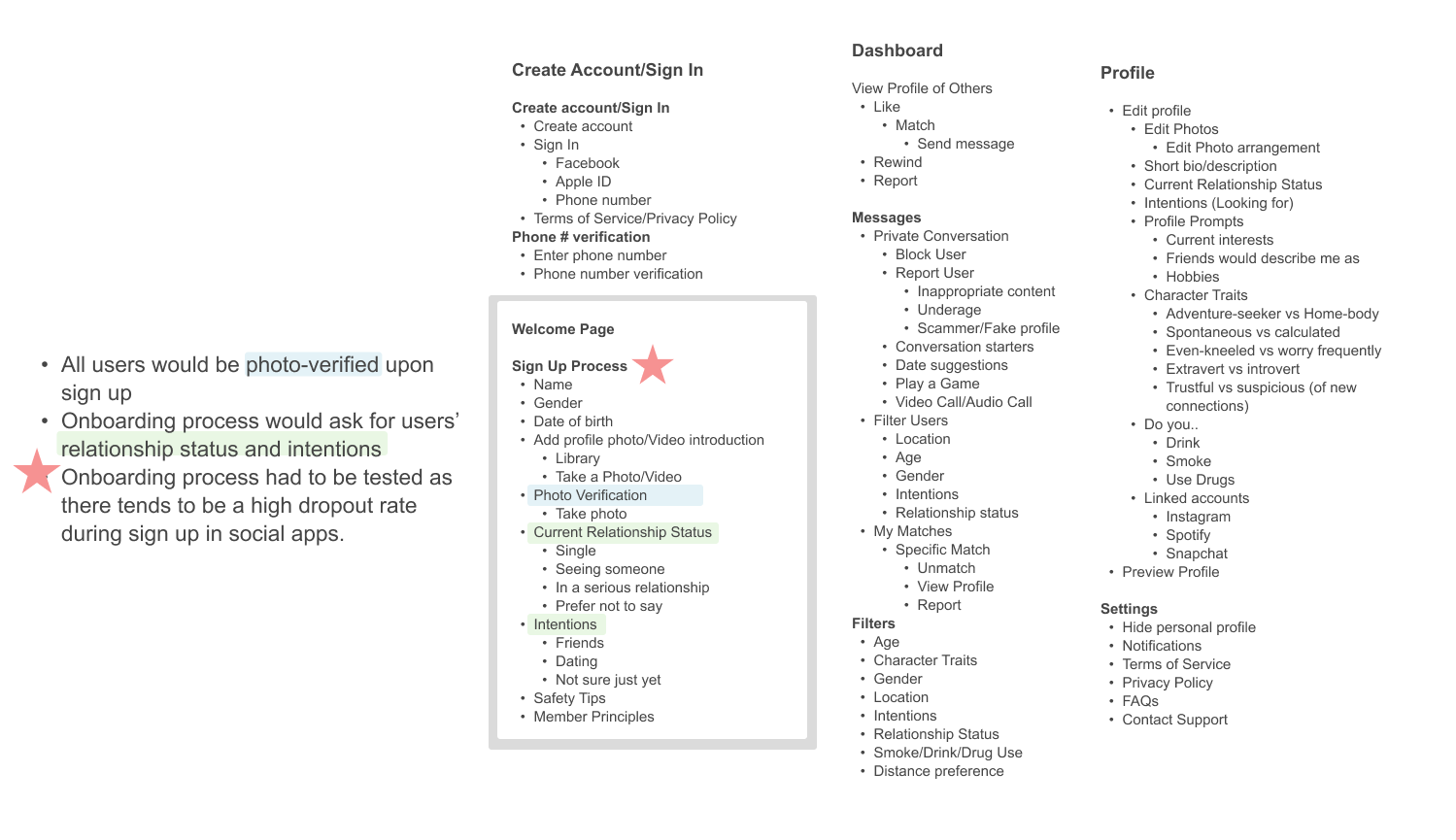
By card sorting and organzing features, I constructed a basic information architecture of the application. I decided to focus on and test the onboarding process as this there tends to be a high dropout rate during sign up in social/dating applications.
Brainstorming Low-Fidelity Wireframes
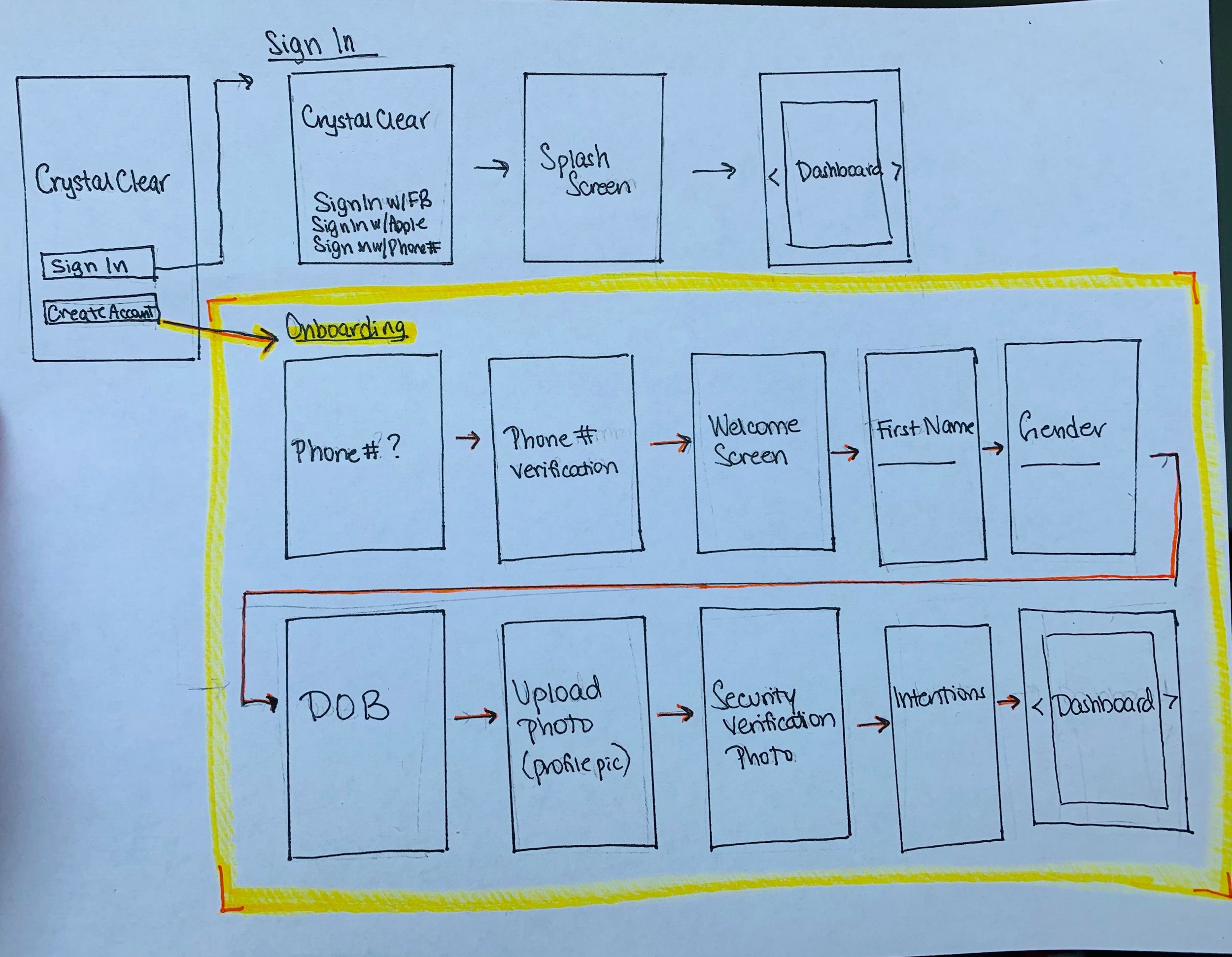
To increase security of the application, users have to input their personal biographic information during the onboarding process. However, I didn’t want users to drop out of the onboarding process before they even got to the main screen of the app, Thus, I decided to draw mid-fidelity screens based off the low-fidelity screens above and test them with users to see what they had to say.
Results from Initial Usability Test
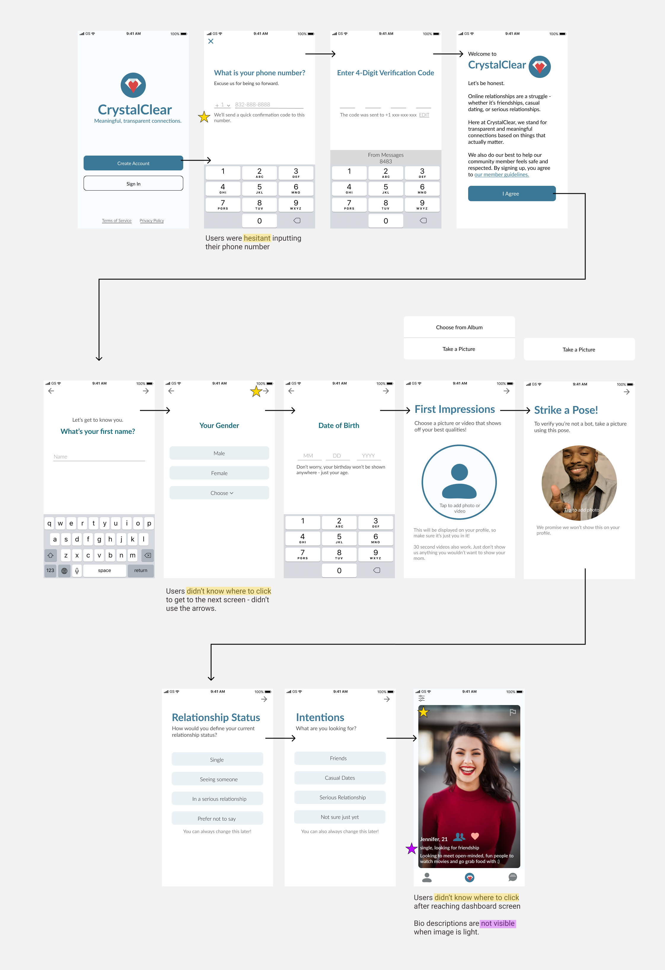
First Iteration of Onboarding Process
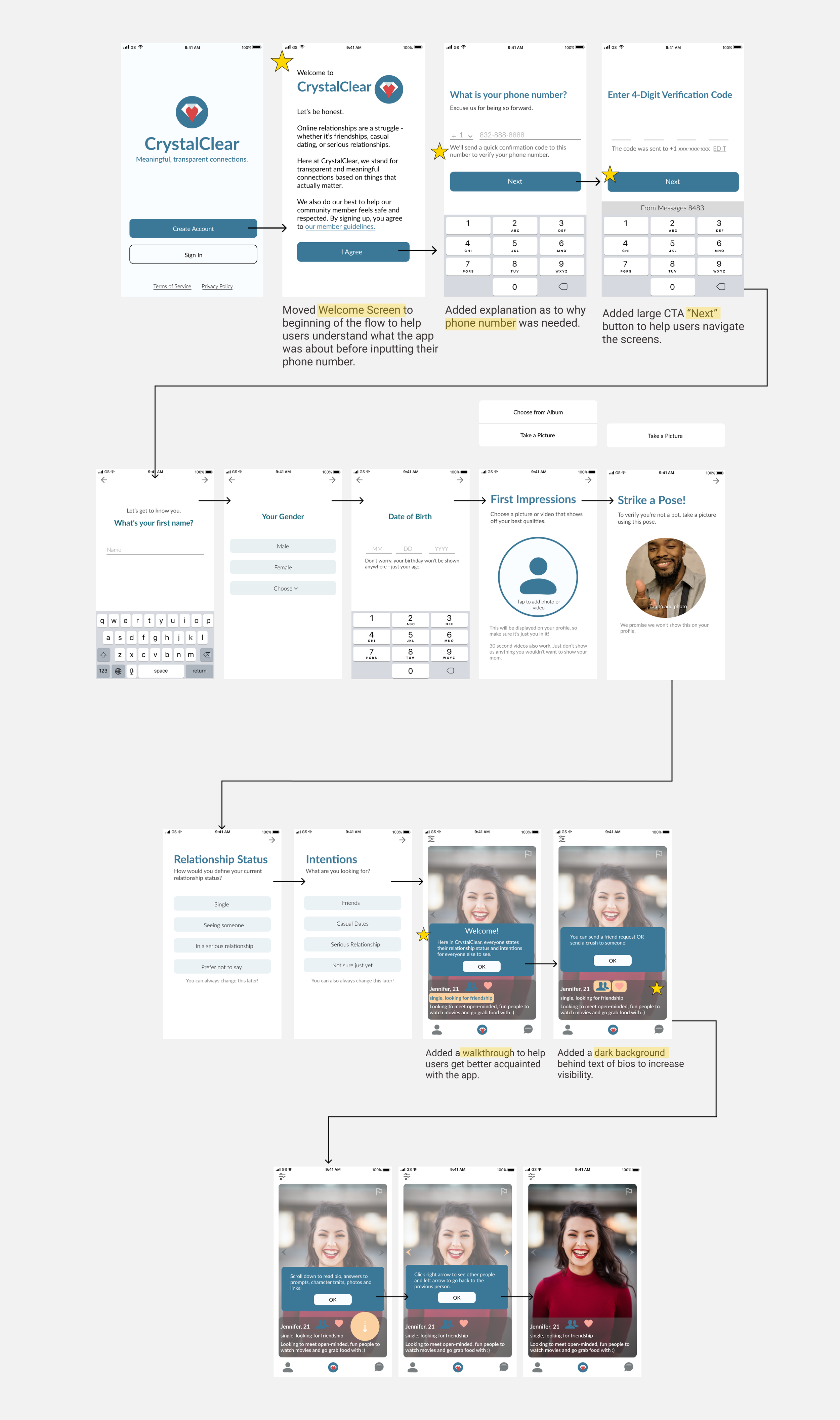
After making above changes, I tested the prototype with 9 users through the platform Maze. Their task was to create an account with CrystalClear and to get through the walkthrough to get acquainted with the app. The results below were given through Maze.
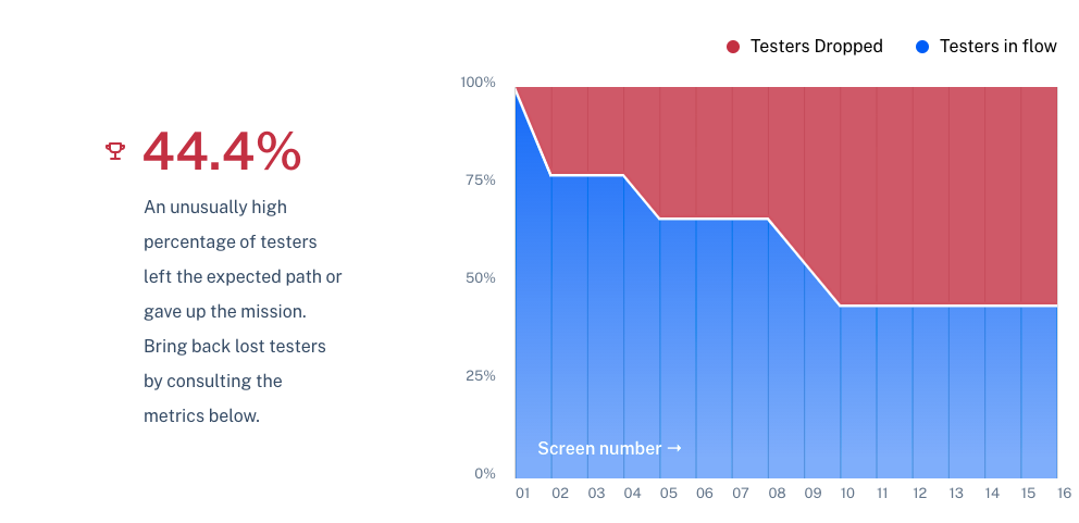
Only 44% of the users clicked all the way through to the dashboard while others either dropped or got lost. When asked what they would improve, users said the flow was too long.
In a survey, 75% of users said they would abandon the application at some point.
Because of the high dropout rate, I decided to make changes to shorten the onboarding flow and add a status indicator so users would know how far along in the onboarding process they are. I then tested the screens again, with the same number of users of the target audience.
Final Iteration and Flow
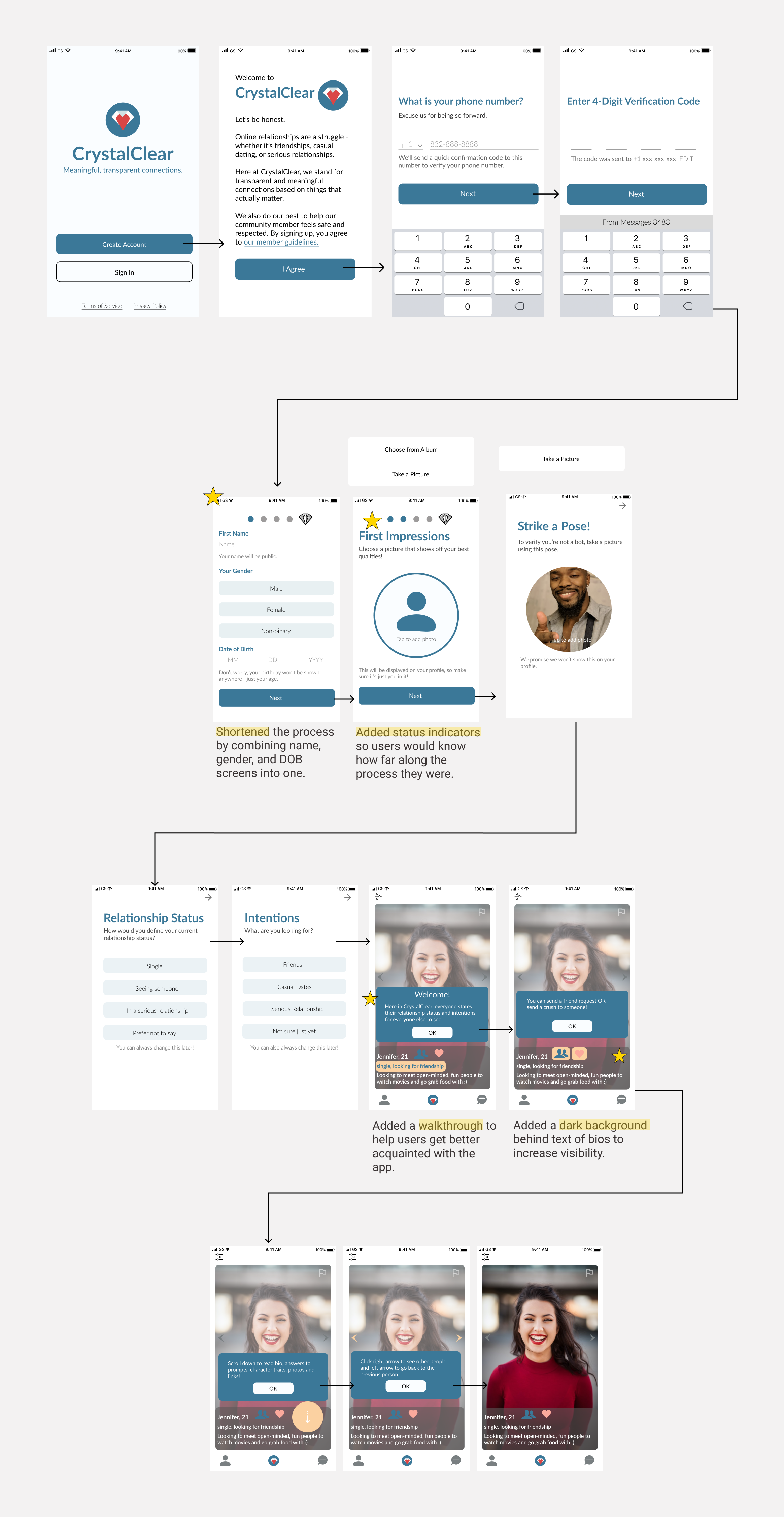
Onboarding Process and Walkthrough
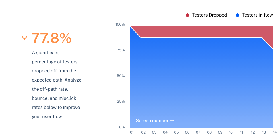
After adding status indicator and shortening onboarding flow , 62% of the users indicated they would NOT abandon the application. 77.8% of the users completed the full onboarding process.
Future Explorations
This project was really interesting to me as I learned that there are still so many improvements to be made on social/dating applications, especially during this period of time when a lot of school and work is still done remote. People crave new connections and our phones can help provide that with social applications that would allow people to easily connect.
I learned that all the necessary information necessary to sign up on an app can still be included if designed in a way to make the onboarding process seem less exhausting. I also learned the importance of CTAs and how helpful they can be to quickly and accurately get through the onboarding.
In the future, I would want to focus on exploring and testing the matching and chat features of the app. Specifically, whether the number of matches can be increased with an in-depth filtering feature of users by age, character traits, relationship status, and more.