Snapshot:
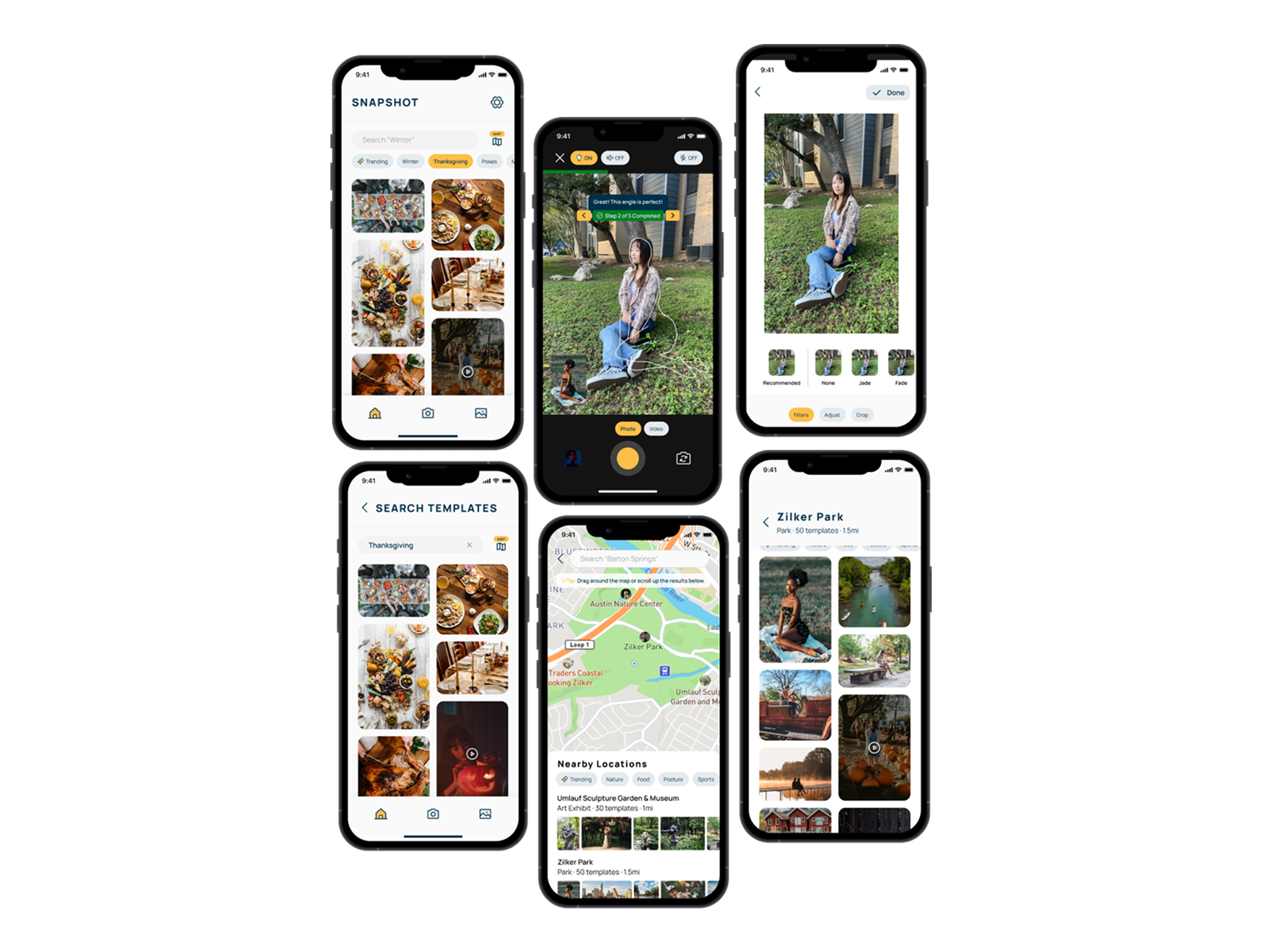
Snapshot is a mobile application that provides templates for taking photos, so users can create picture-perfect photos for friends and themselves.
Background
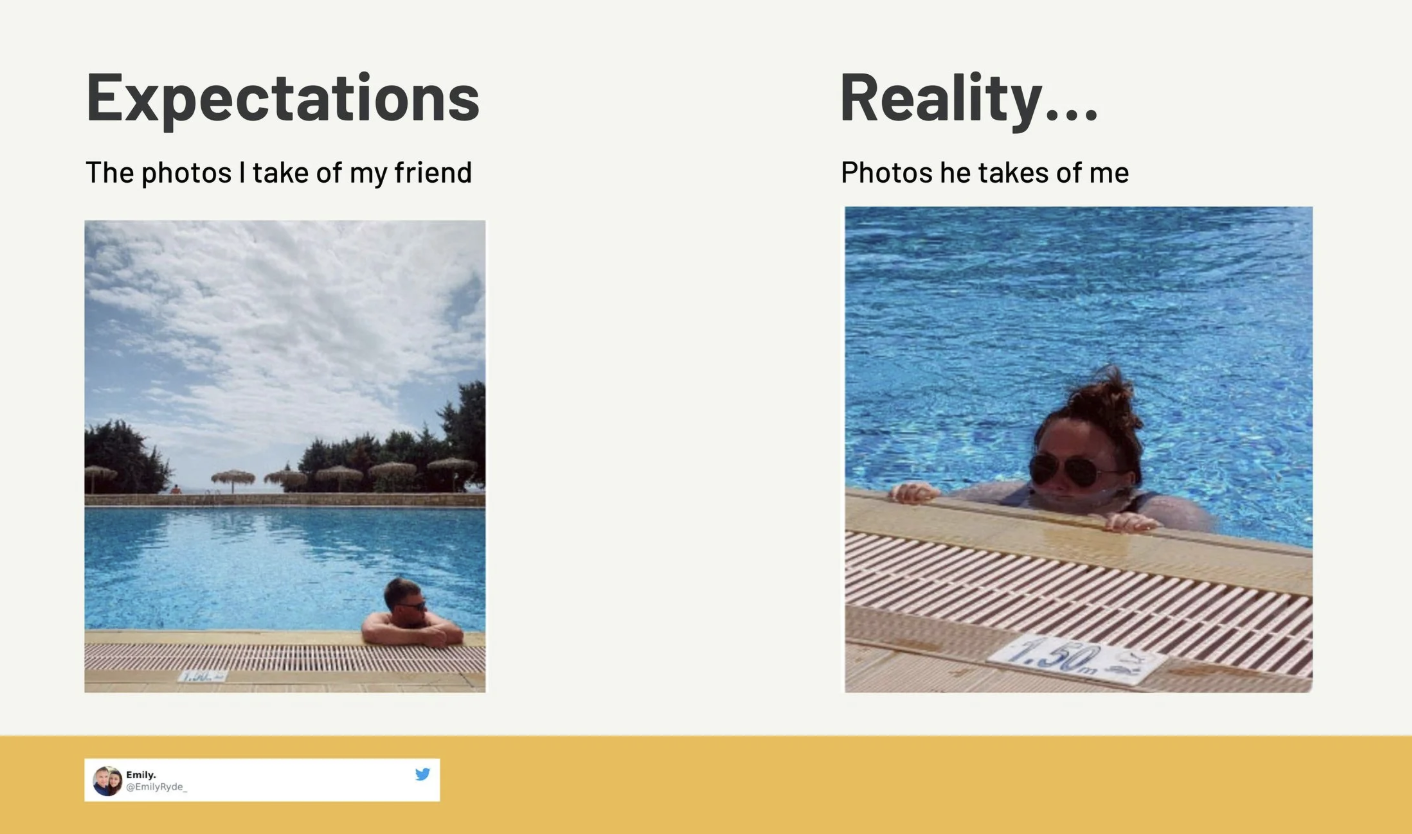
This was a group project for the Interaction Design class in UT Austin’s Master of Information Studies program. As a team of five, we initially wanted to design an app that lets users recreate famous movie scenes using templates at their location. Through research, we discovered that the biggest struggle people have is creating the “perfect shot” of themselves and their friends.
We learned that despite the abundance of photo and video-taking applications on the market, very few provide real-time feedback and suggestions for improving the photo at the moment of capture.
Thus, we created Snapshot - an app that provides templates and real-time feedback to take an unforgettable photo.
Members of our team: Me, Samarth Nayyar, Yiwei Wu, Gayathri Ramesh, and Fanyi Zeng
Research
We had many ideas for application features but did not know where to start. Before we began sketching the application's design, we wanted to talk to members of our target audience to learn about their current photo and video-taking experience.
To do this, we conducted initial interviews (with friends and family) and sent out a survey to understand more about the users' experiences and expectations. We also conducted a competitive analysis to understand what the current market offers.
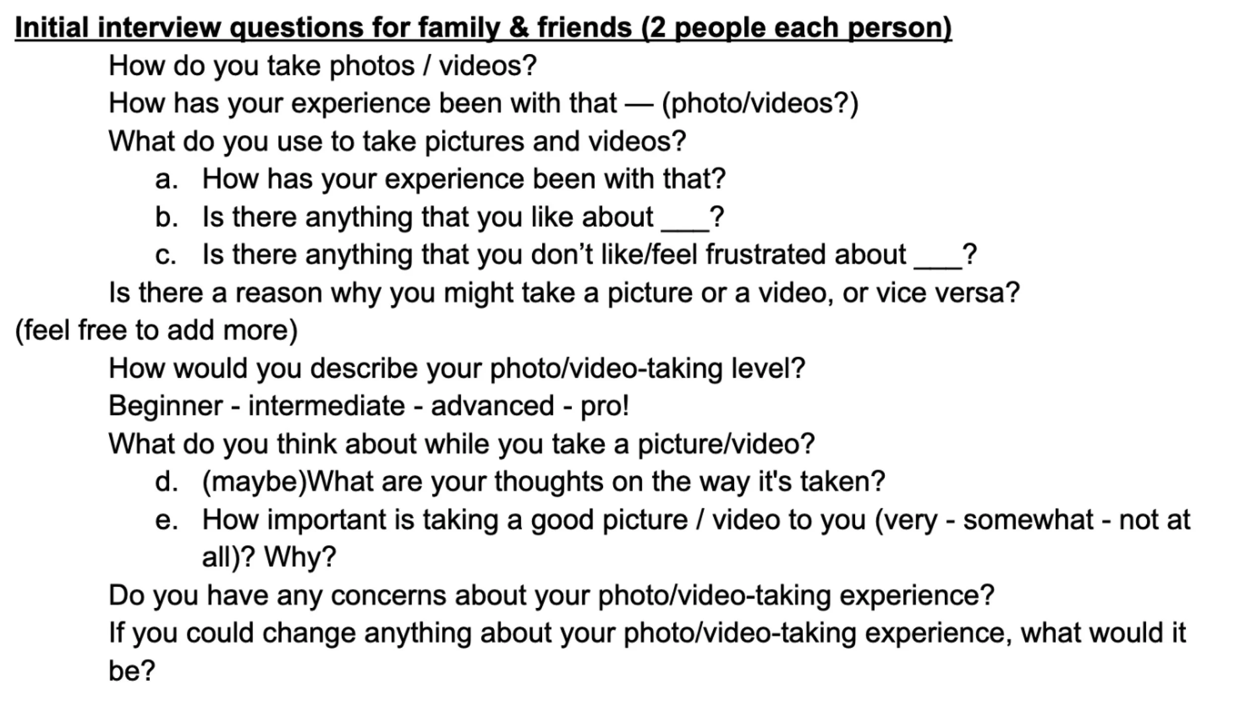
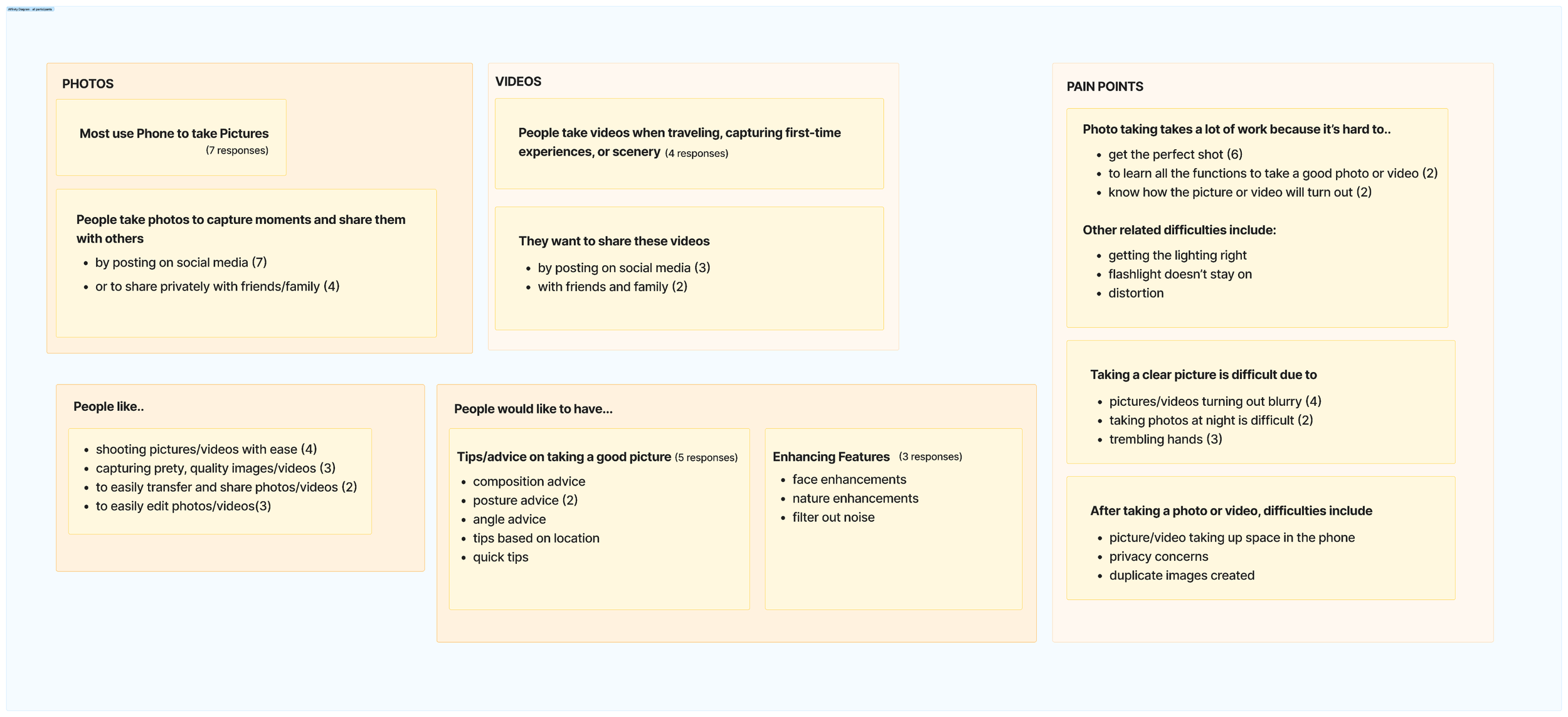
We began our project by conducting interviews with friends and family. We wanted to get a broad understanding of how people take photos, so our interviewees had varied levels of expertise in photography. Our goal was to identify pain points people encounter when taking photos and/or videos, and to determine what improvements could be made to their current experience.
We interviewed 10 individuals and asked them which devices they use to take photos and videos, when they typically take photos or videos, and what pain points they currently encounter.
Interviews
We learned that overwhelmingly, people use their phones for taking photos and videos and are more likely to take videos when travelling or visiting a new place. Our interviewees want to take a nice photo or video to share with family and friends but that requires a lot of effort and not everyone is a professional.
We also discovered that there are a variety of possible features we could include in our application to help solve some of the pain points discovered. To help narrow down features people would find most beneficial for their use, we decided a survey would be our best solution.
Observations
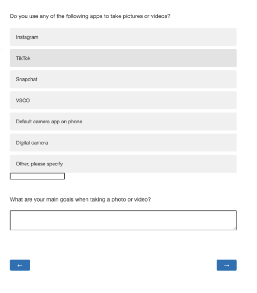
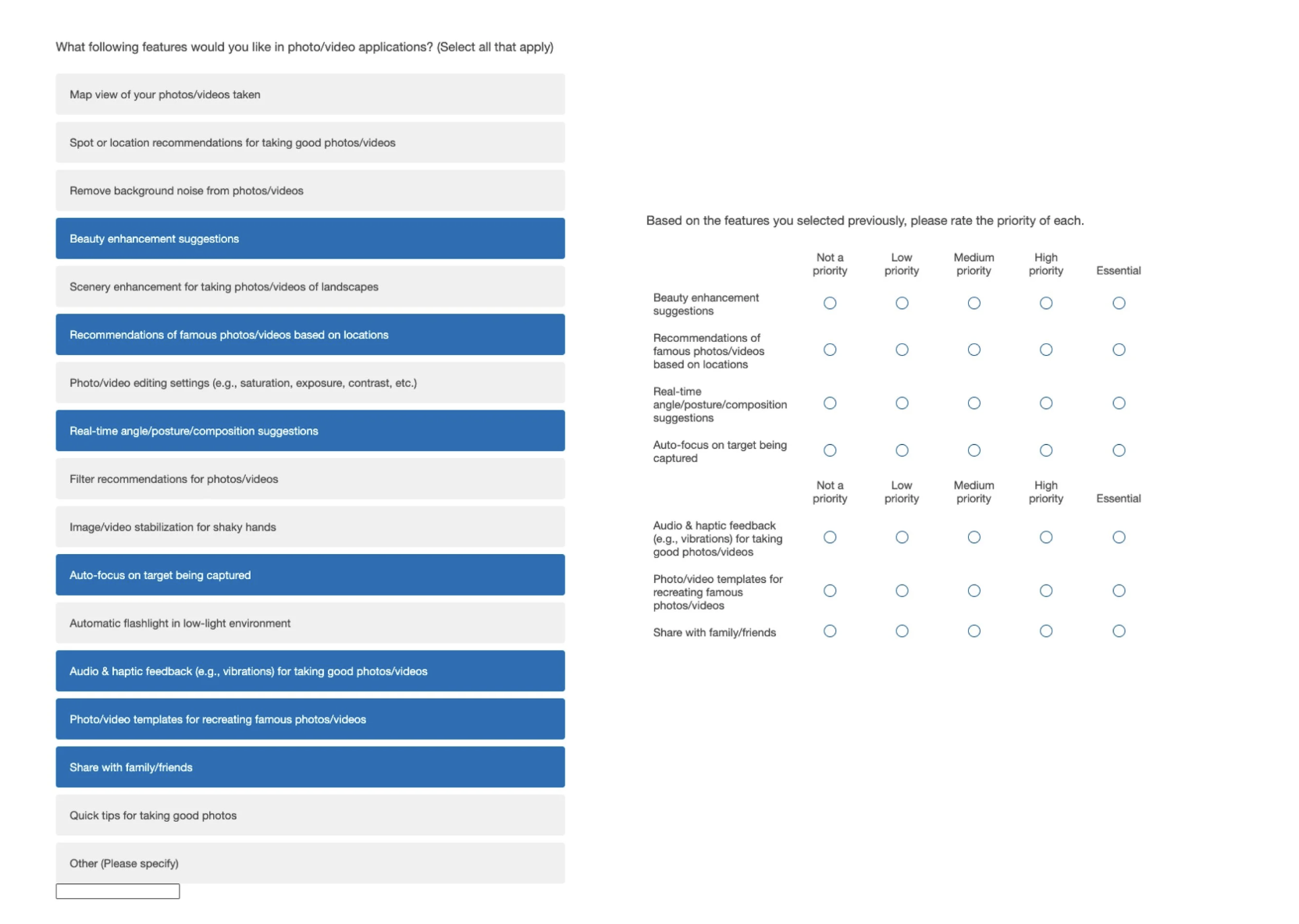
To help narrow down the list of desirable features our app would include, we designed a survey in Qualtrics and distributed it to friends, across various Facebook groups, and more (we collected over 80 responses!). Our survey consisted of 4 main questions asking people:
- what apps they use to take photos/videos
- what their main goals are
- list of features they would like a photo/video-taking app to have
- a question ranking those selected features in terms of priority
Survey
Observations
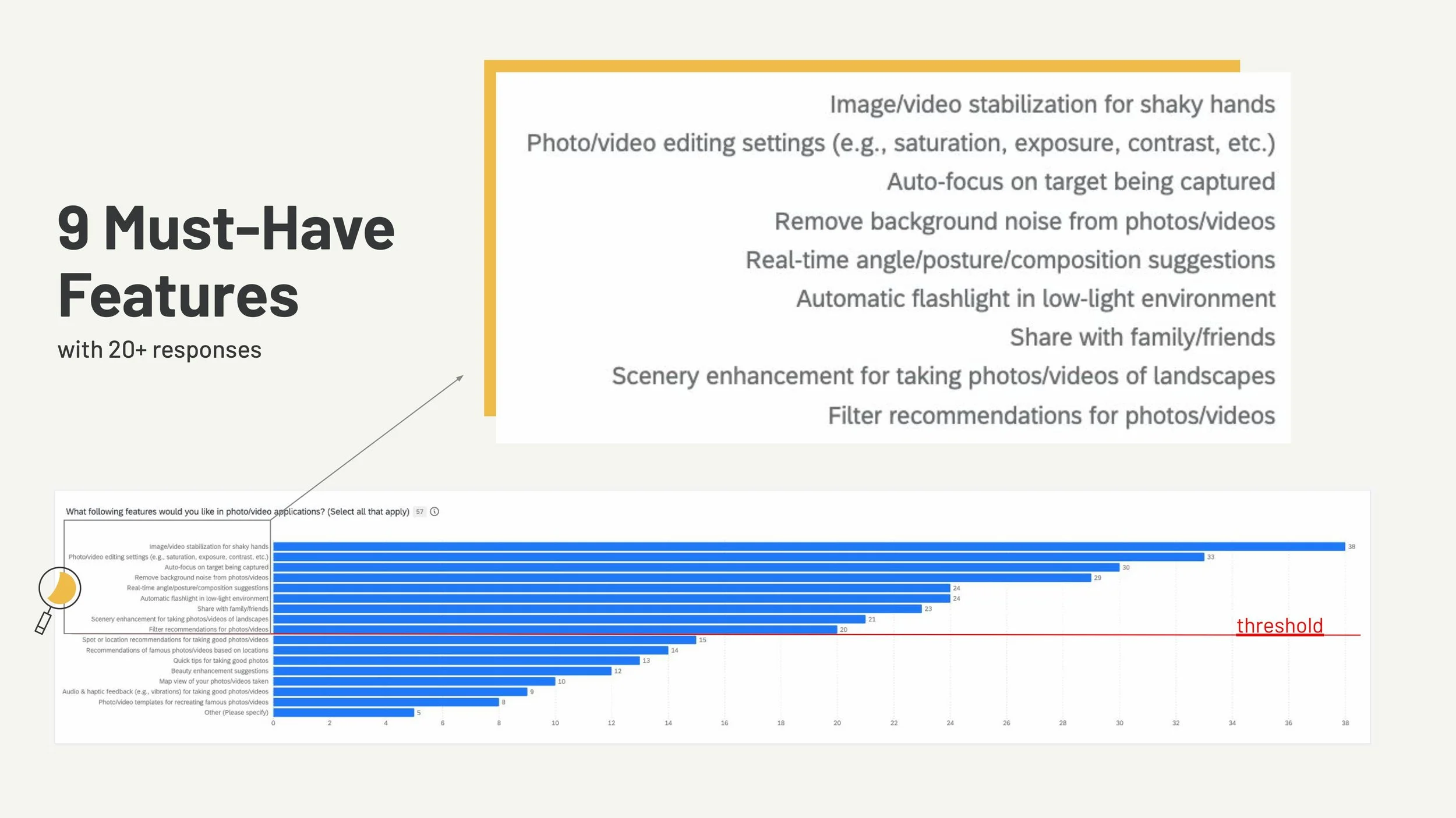
We decided that features selected by 20+ people were ones we would definitely have in our app, and those with fewer than that we would consider. There were 9 features we knew we would need to include in our app.
These were:
image/video stabilization for shaky hands
photo/video editing settings (saturation, exposure, contrast)
auto-focus on target being captured
remove background noise from photos
real-time angle/posture/composition suggestions
automatic flashlight in low-light conditions
share with family/friends
scenery enhancement for taking photos/videos of landscapes
filter recommendations for photos/videos
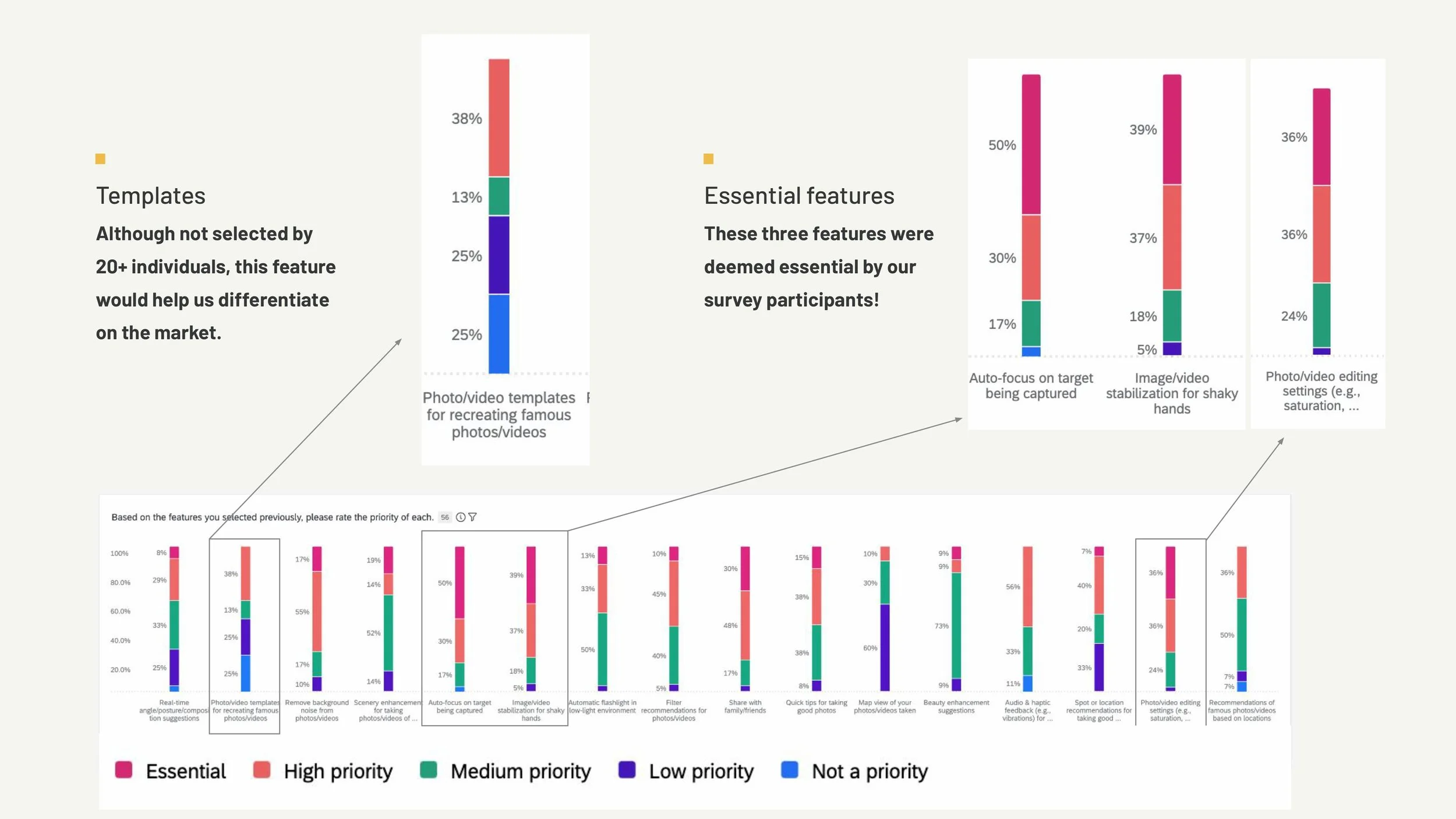
Although photo/video templates for recreating famous photos and videos were not a feature selected by many, out of those who did select it, 38% deemed that feature a high priority. Because of this and the fact that this feature would help us differentiate on the market, we decided to keep this feature.
Competitive Analysis
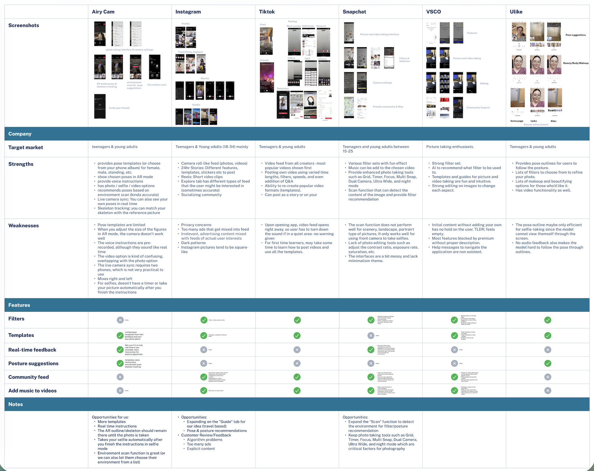
We also conducted a competitive analysis to assess what other competitors in the market were doing. Specifically, we looked at photo/video-taking applications. We started with the more popular ones like Instagram, Snapchat, TikTok, and VSCO, but also discovered less popular apps that influenced our application's design, like AiryCam and Ulike.
We discovered that most applications offer templates that let users capture specific photos or videos, but few provide real-time feedback on poses, camera angles, and lighting.
Designing, Prototyping, and Testing
After conducting our research, each of us had an idea of what the app would look like but since we all differed in our vision, we did several activities and additional research to design the application.
Brainstorming initial wireframes
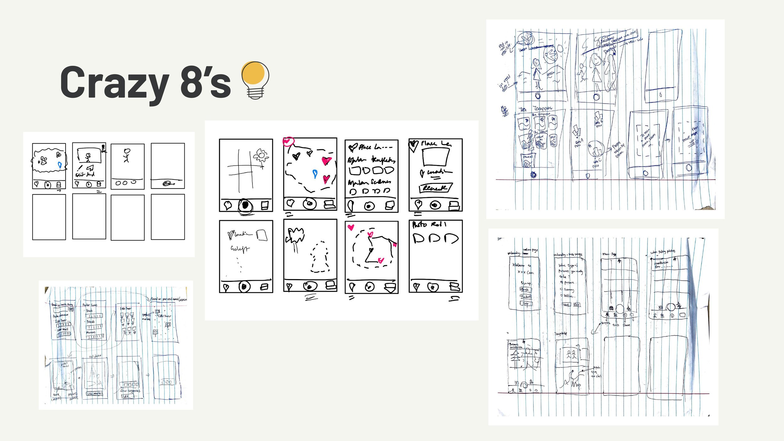
We began with a crazy 8’s activity and then each presented our ideas to the team, giving an overview of what each screen would include.
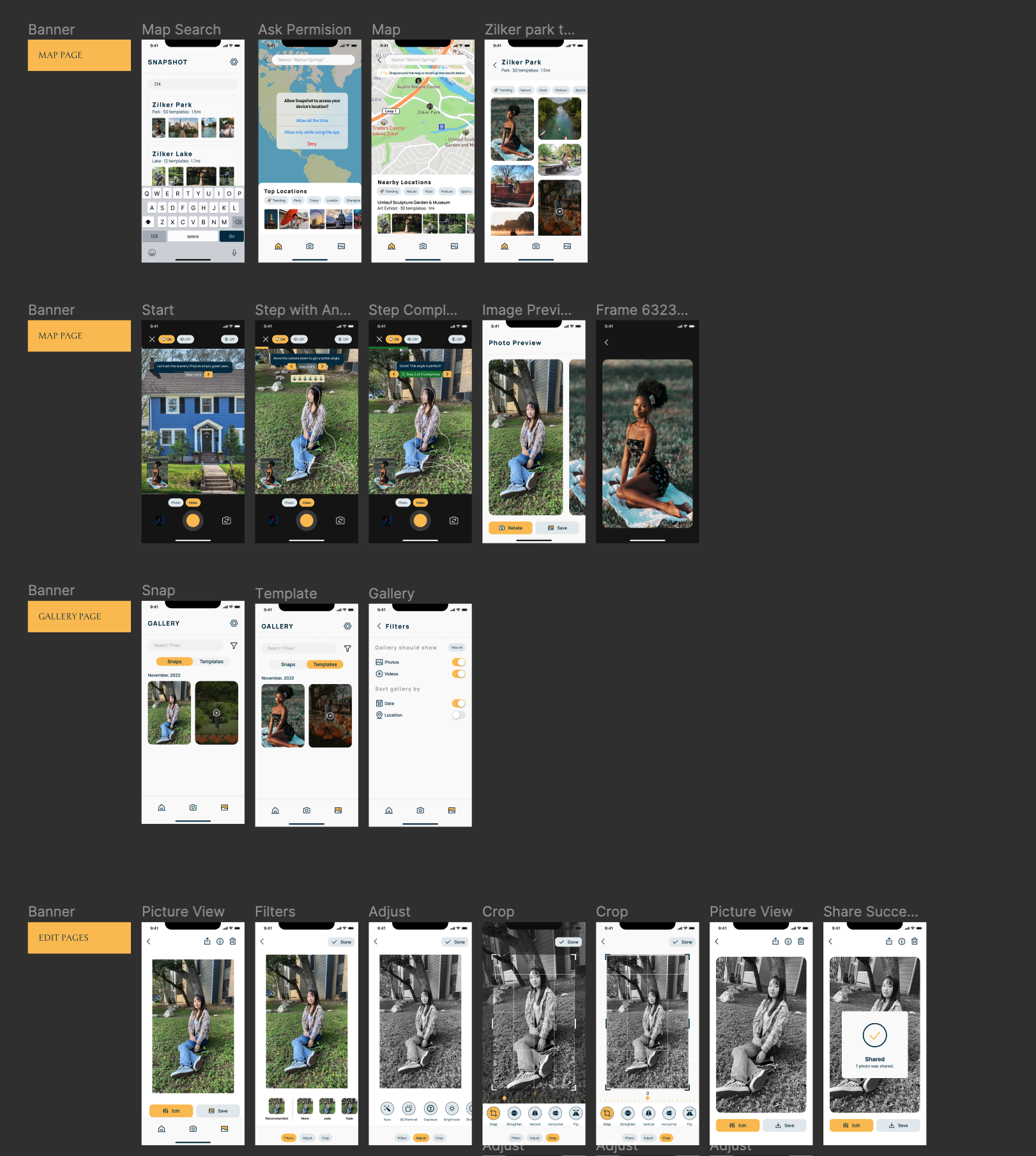
Doing this helped us align on the key features and screens of the application. This would include, most importantly, a camera flow where the user would take pictures using templates, a search functionality for finding templates, and a map allowing the user to find templates based on their location.
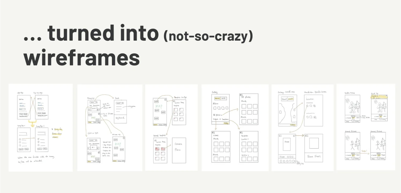
Using these as inspiration, two team members went on to design the first wireframes of our application.
Concept Testing
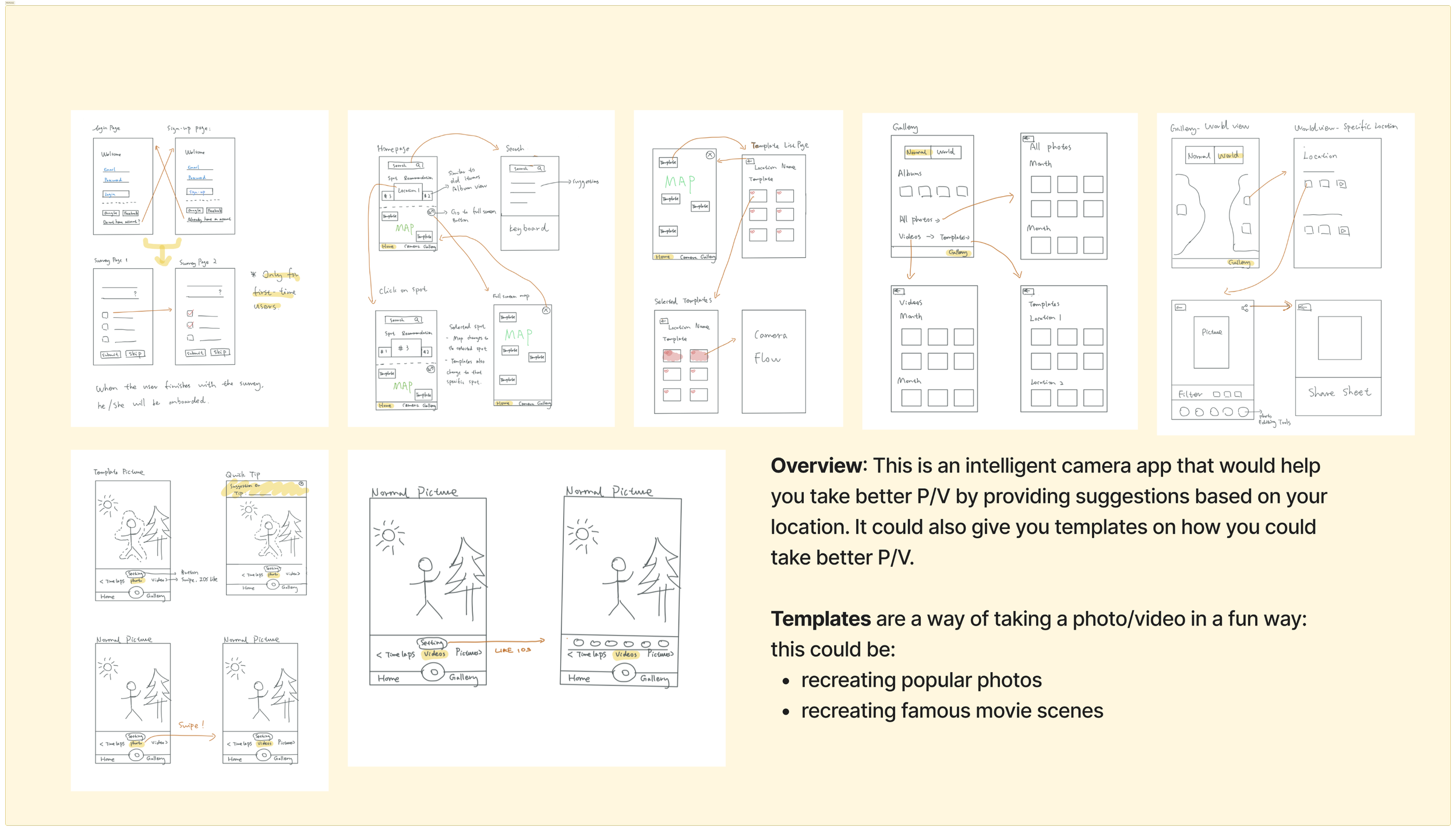
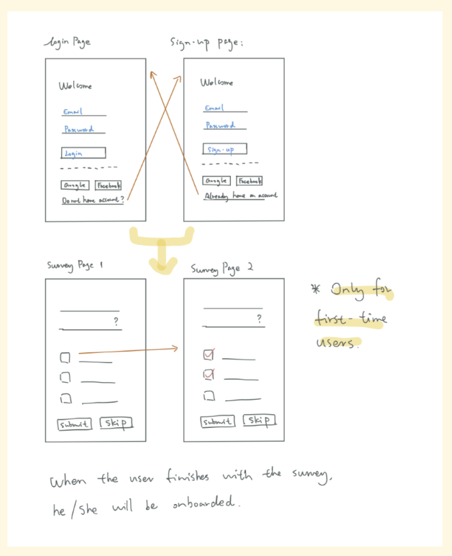
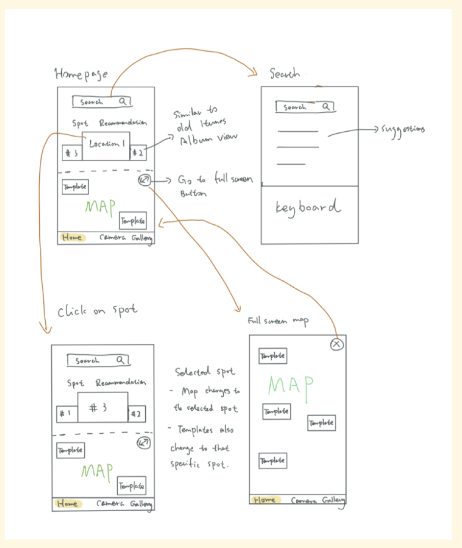
We then conducted a concept test to move forward in our design. We used hand-drawn sketches in a semi-structured interview where we set up the following context:
Overview: This is an intelligent camera app that would help you take better photos by providing suggestions based on your location. It could also give you templates on how you could take better photos and videos.
Templates are a way of taking a photo/video in a fun way. This could be:
recreating popular photos
recreating famous movie scenes
The moderator then shared each screen one at a time and asked the participants to think aloud about each. Doing so allowed us to understand what our potential users thought of the general concept of the app, what needed improvement, and what was currently working well.
We had 3 previous participants from our initial interviews (for longitudinal measures) and 7 new participants.
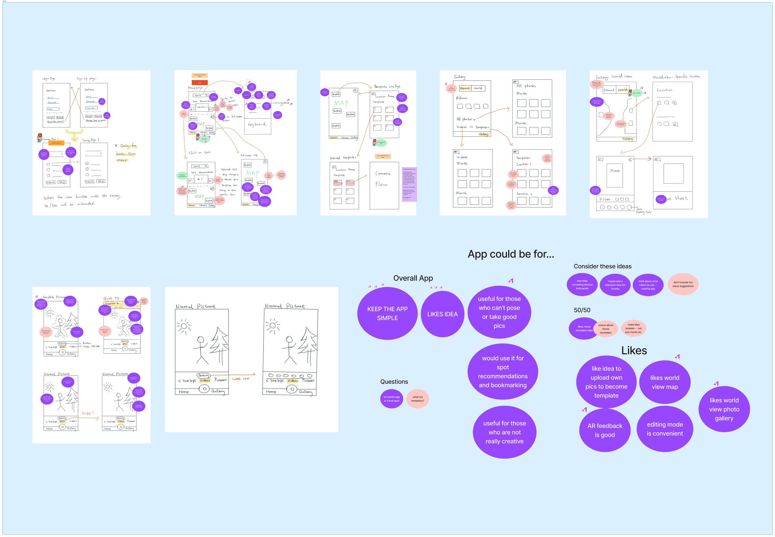
Overall, we learned that people liked our idea. It would be especially useful for those who don't know how to pose or take good photos, or for people who don’t want to think too hard about coming up with new photo ideas.
We also learned that participants want features to be kept as simple as possible.
Our differentiator feature, recreating famous movie scenes, was something people liked but thought the app shouldn’t focus solely on that idea. People would be more likely to use it if there were templates based on pose recommendations.
With that in mind, we went on to design and improve the fidelity of our screens.
Observations
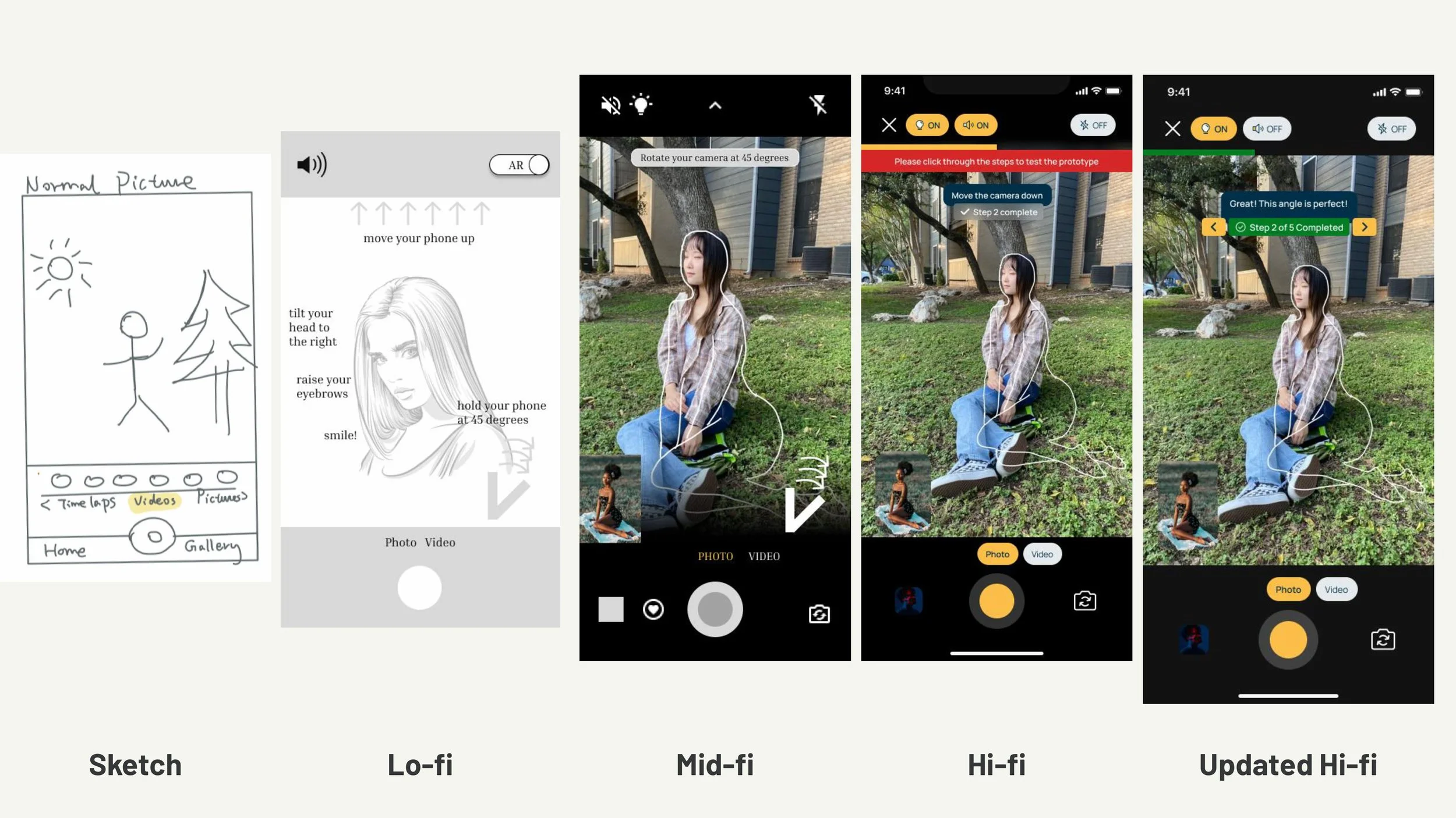
Designing low and mid-fidelity screens
Team members individually went off to design a higher fidelity version of the wireframes to explore various possibilities for the application.
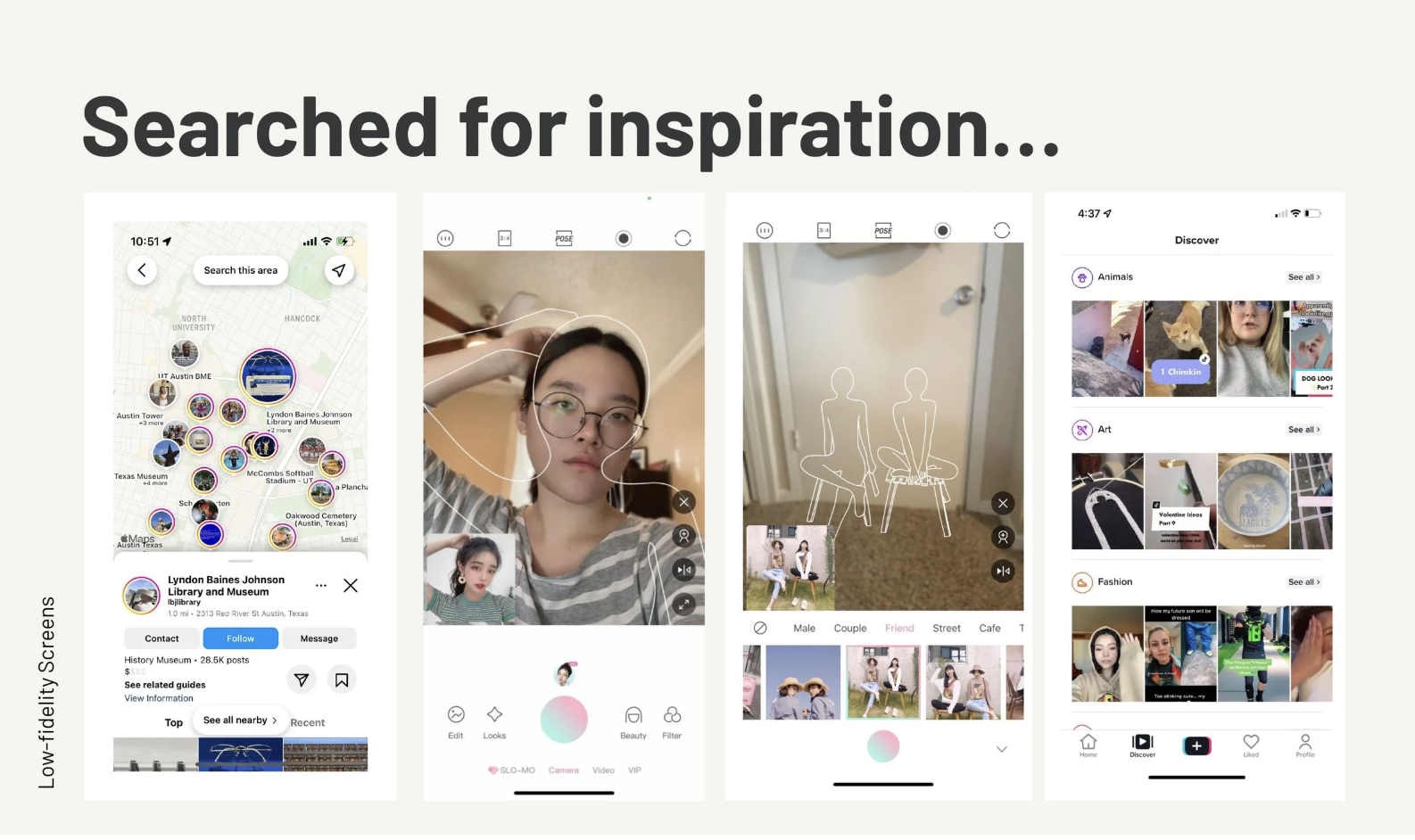
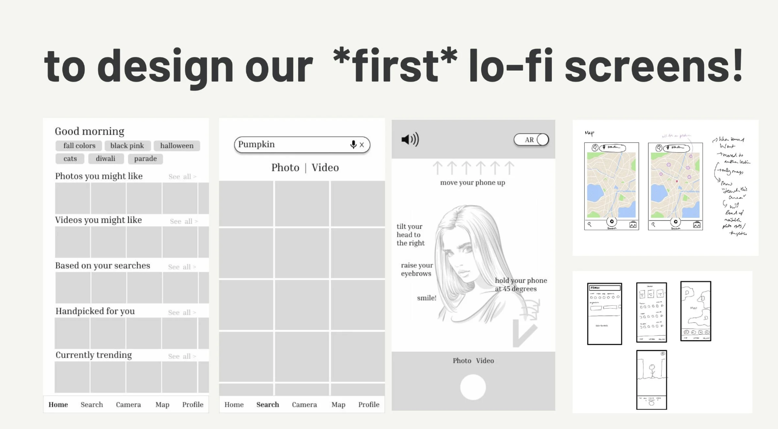
Although we had ideas for specific screens in mind, we still had to figure out the user flows for each part of the application. To do so, we met up to discuss features and functionalities more in-depth.
We went through the design suggestions and concept test results and drew out the flow screens on a whiteboard to discuss specific features we should keep, add, or delete based on concept test results. We also used sticky notes to organize ideas or questions that arose during the group discussion.
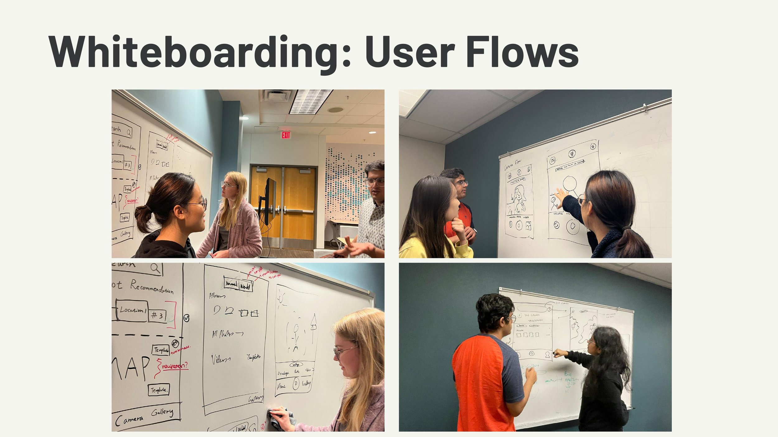
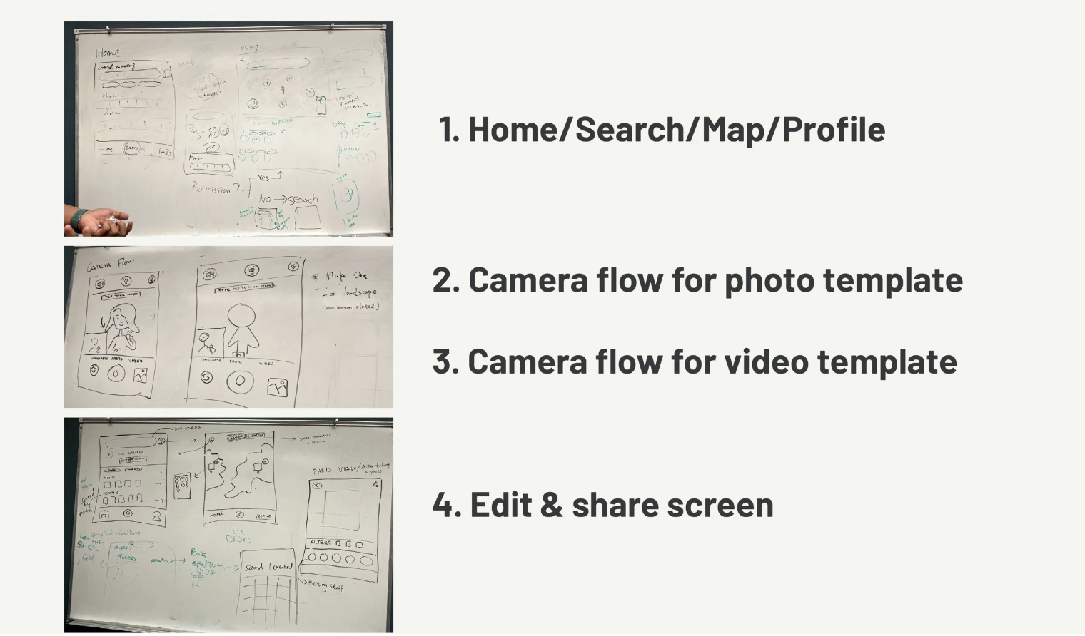
After that meeting, the group had a better idea of what the whole app, with all of it’s sub-flows, would look like. We used results from the concept test and survey to help guide us in the selection of features we wanted to include during this phase. With everything we had gathered, we were able to combine screens into a mid-fidelity prototype.
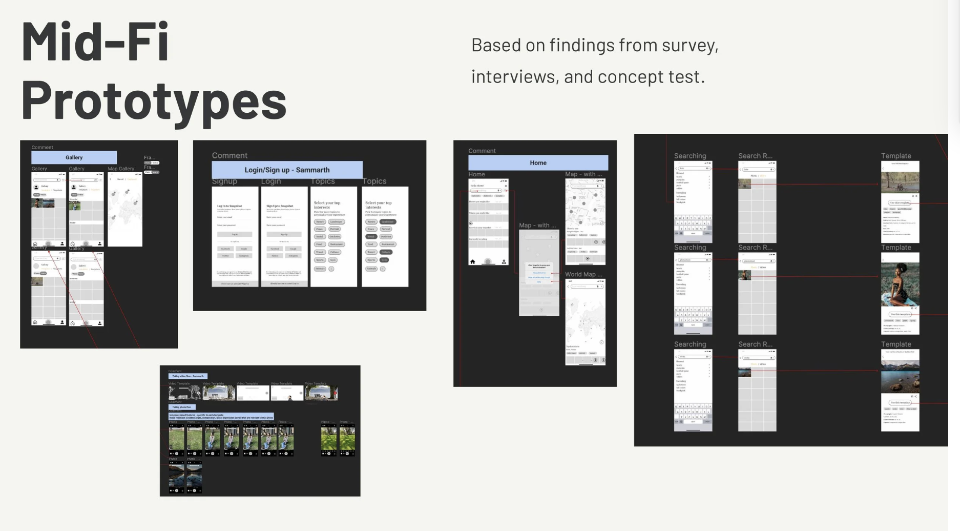
Testing mid-fidelity screens
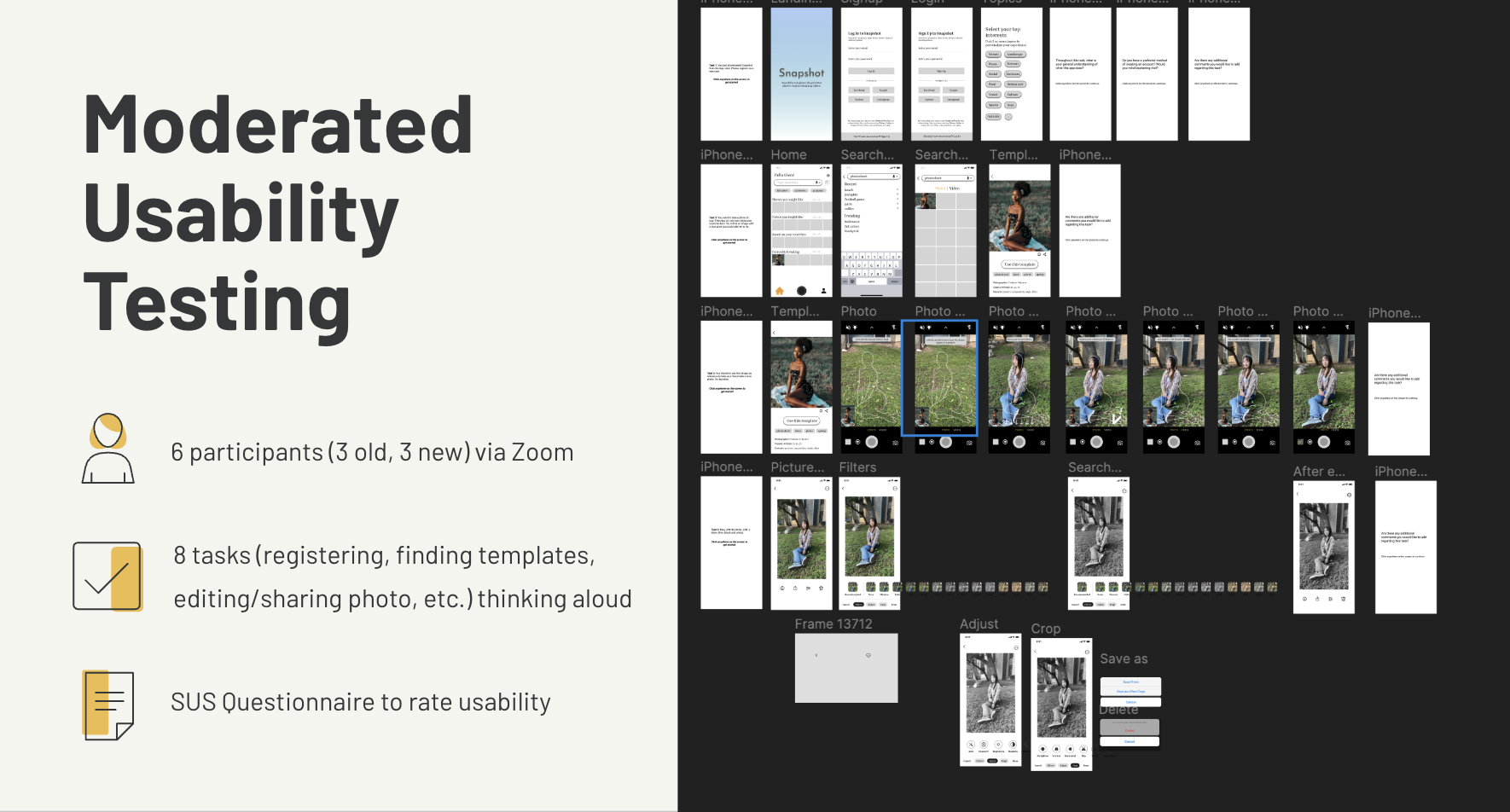
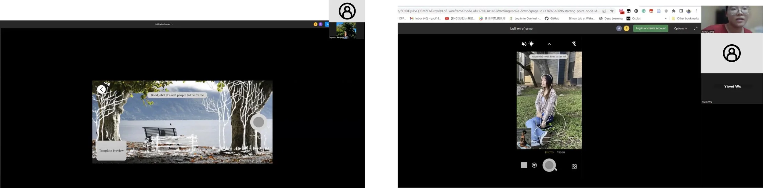
We conducted moderated sessions through Zoom and Figma, encouraging participants to think aloud throughout. We chose moderated sessions as we needed in-depth feedback from our participants and wanted the opportunity to ask follow-up questions.
For this testing, we had 6 participants:
3 old participants (from initial interviews)
3 new participants
There were a series of 8 tasks the participants completed, which were:
Register as a new user
Find a photo template
Use the template as guidance to take a photo
Edit the photo
Share the photo through Instagram
Recreate a movie scene using a template
Find and save templates based on your location
(same task as 7 with a difference in either denying or accepting the use of your location)
We shared the Figma prototype link so each participant could go through each task, then asked follow-up questions. Each participant also completed a SUS questionnaire to assess the usability of our prototype.
Observations
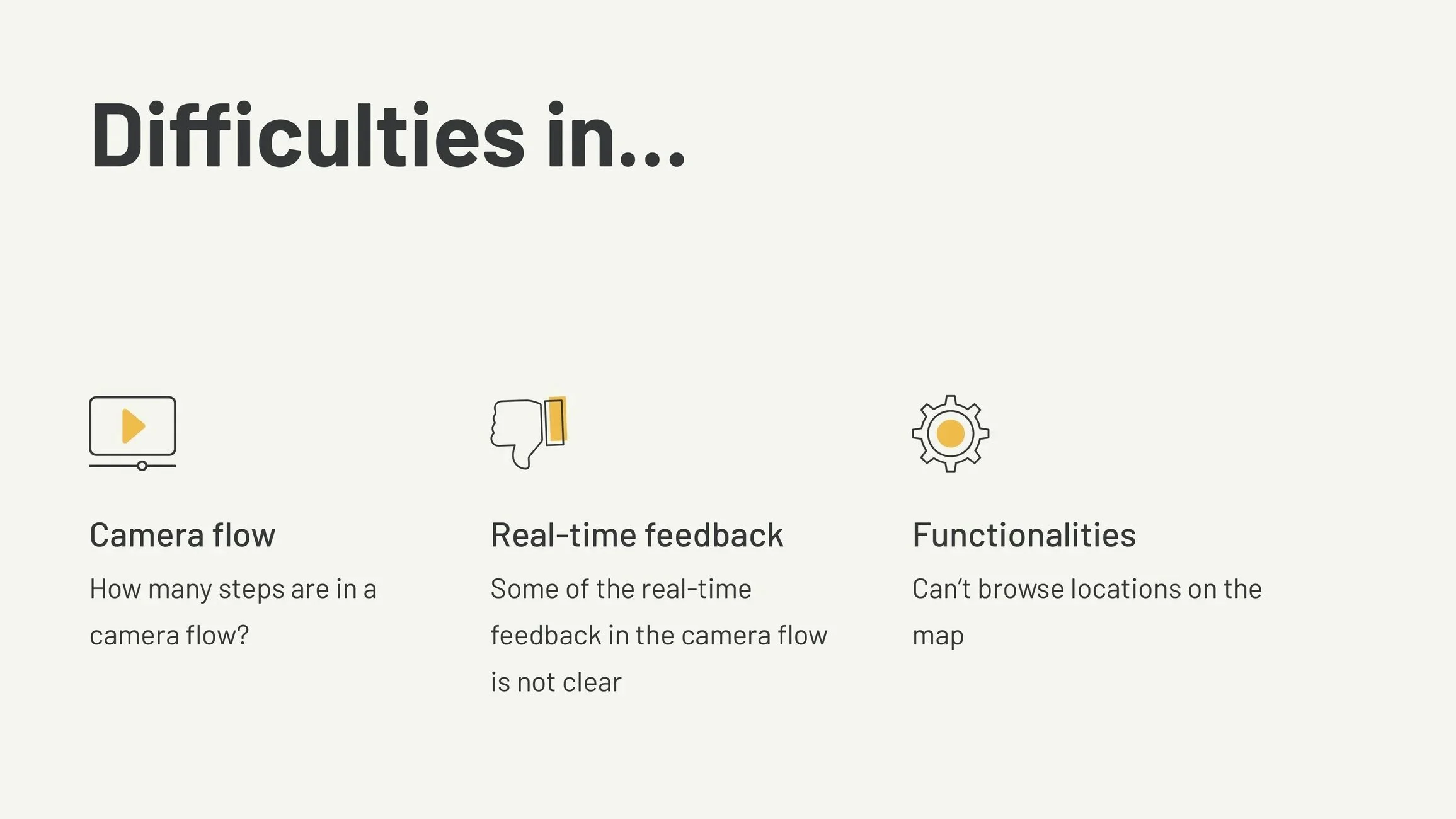
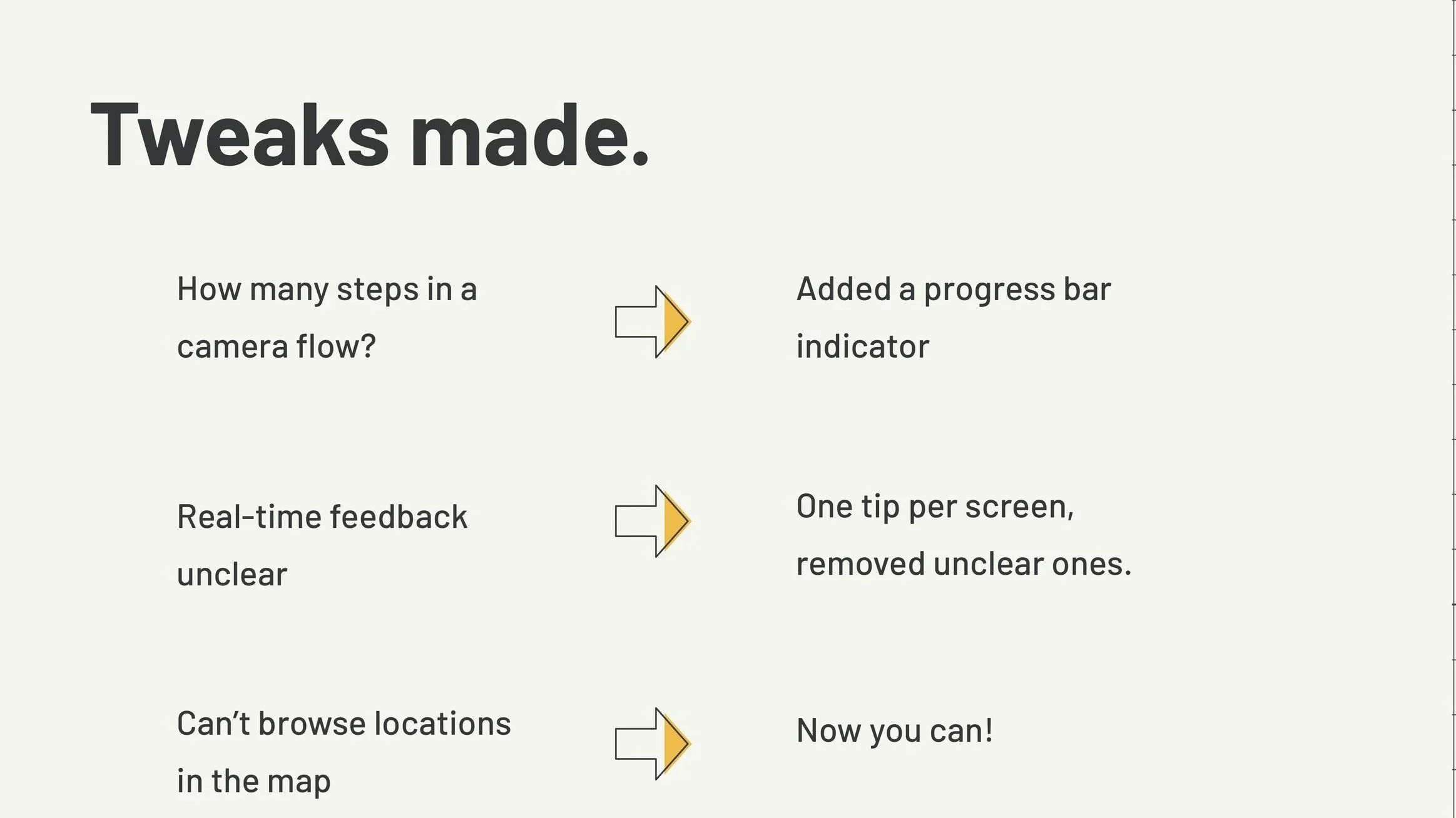
We found that people had trouble with the following:
knowing how many steps are in the camera flows
some of the real-time feedback in the camera flow was unclear
people couldn’t browse locations on the map
With this in mind, we made changes by:
adding a progress indicator on the flows
adjusting real-time feedback
adding browsing functionality in maps
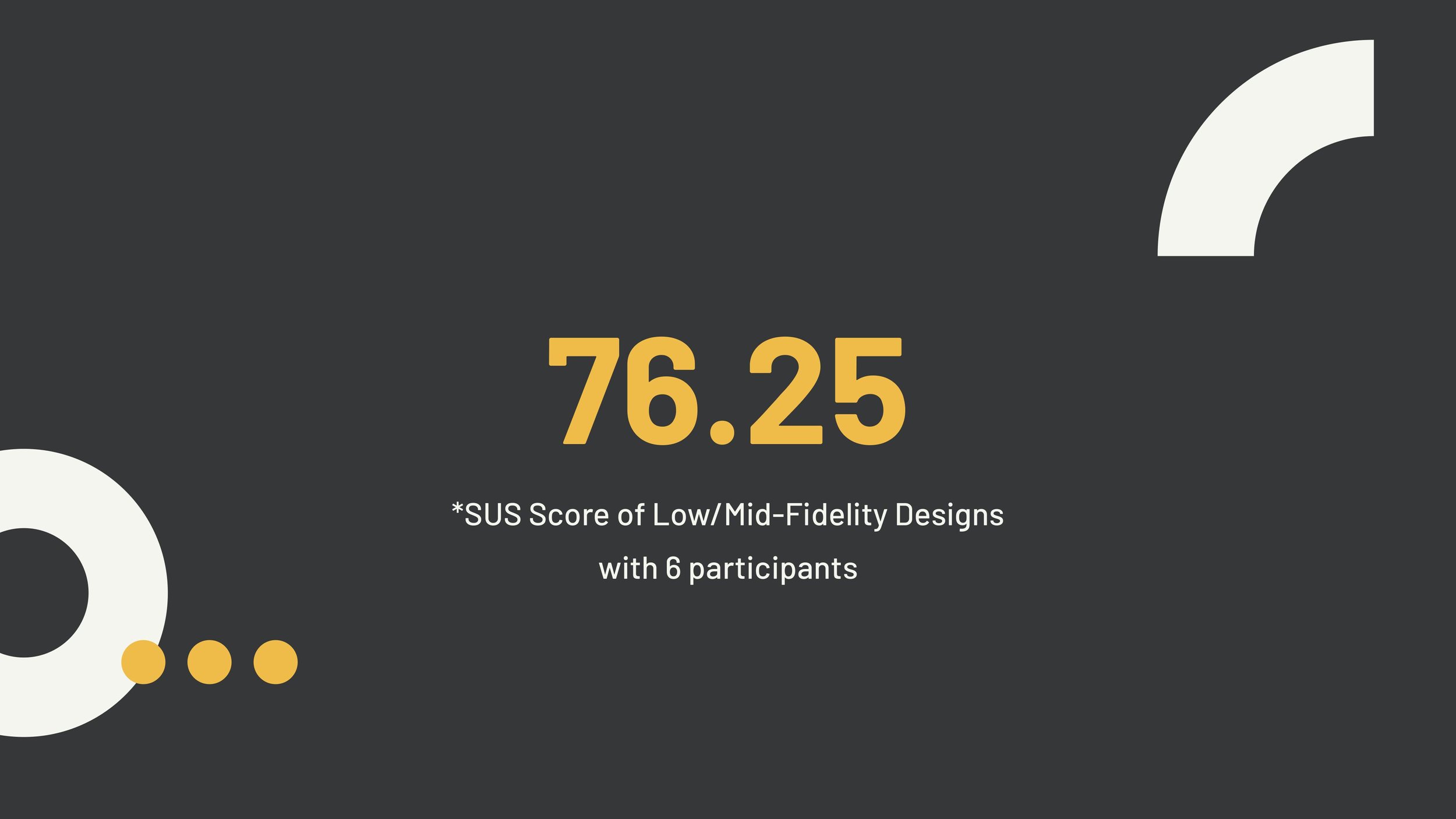
The SUS for our Mid-Fi design was 76.25. A SUS score of 68 is typically deemed as average usability. Based on this information and participant feedback, the mid-fi design was usable, but there was still work to be done. Thus, we continued to improve the app experience by addressing feedback and increasing design fidelity.
Testing high-fidelity screens
With insights from mid-fidelity testing, we designed high-fidelity screens and tested them.
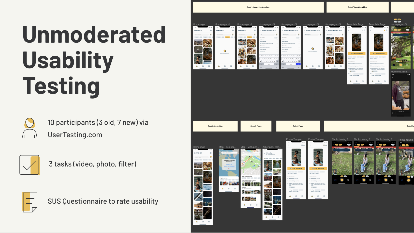
We used UserTesting.com to conduct unmoderated usability testing and observe the impacts of our design changes. We chose unmoderated testing as we only needed to watch the behavior of our participants as they used the application.
For this unmoderated testing, we had 10 participants:
3 old participants (from initial interviews)
7 new participants (through UserTesting)
These were the three tasks we had users complete:
You and a friend are at a pumpkin patch for Thanksgiving and they want you to take a video for them. Use the Snapshot app to help your friend record that moment.
You and a friend are exploring Austin for the first time and are visiting Zilker Park. She would like you to take a photo of her sitting on the lawn in the park. Use the Snapshot app to find Zilker Park and capture a photo of your friend.
You would now like to edit the photo you recently took using the monochrome filter and share it as an Instagram post.
After completing these three tasks, participants were given a few post-task and post-test questions, including filling out a SUS questionnaire.
Observations
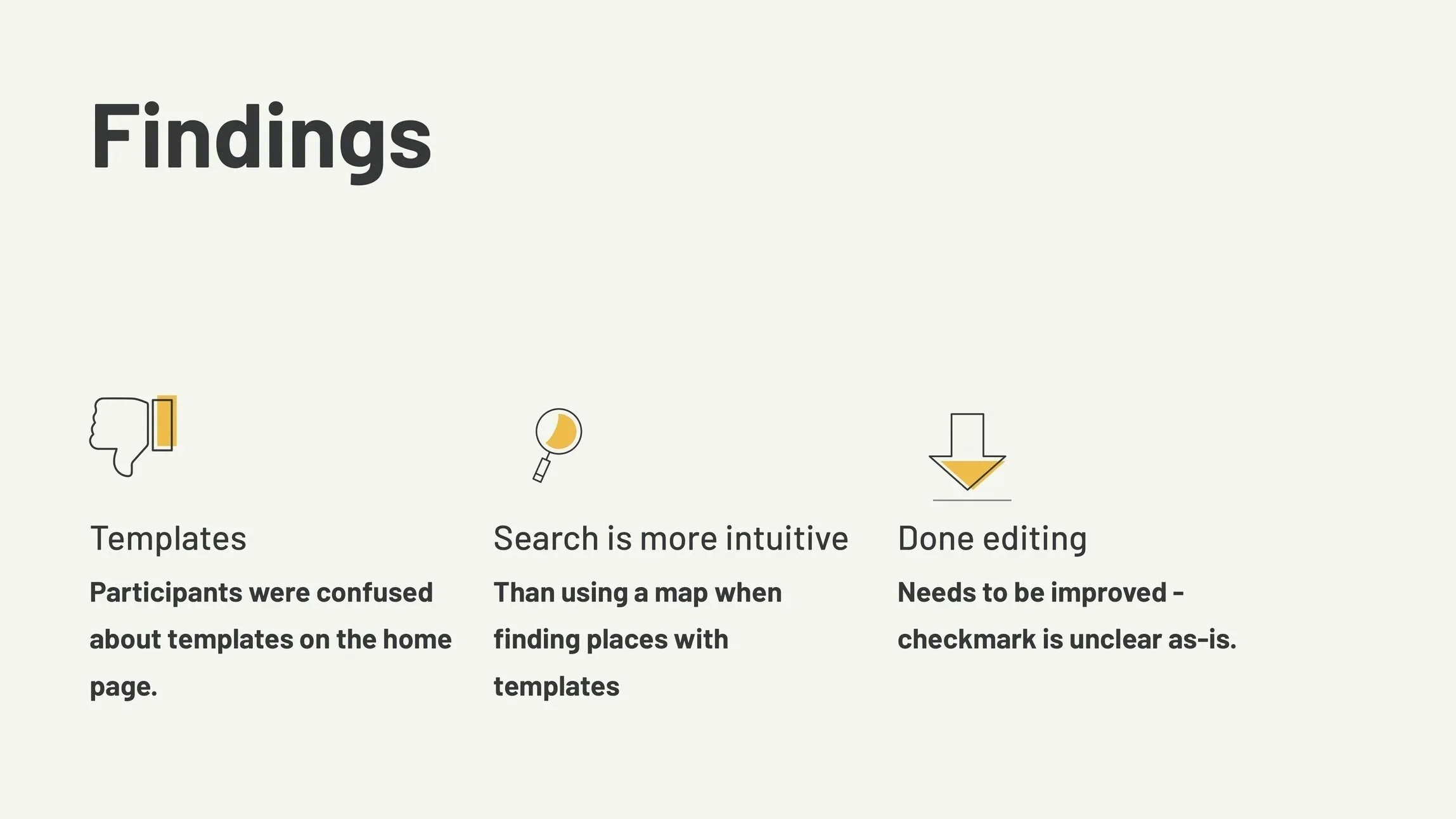
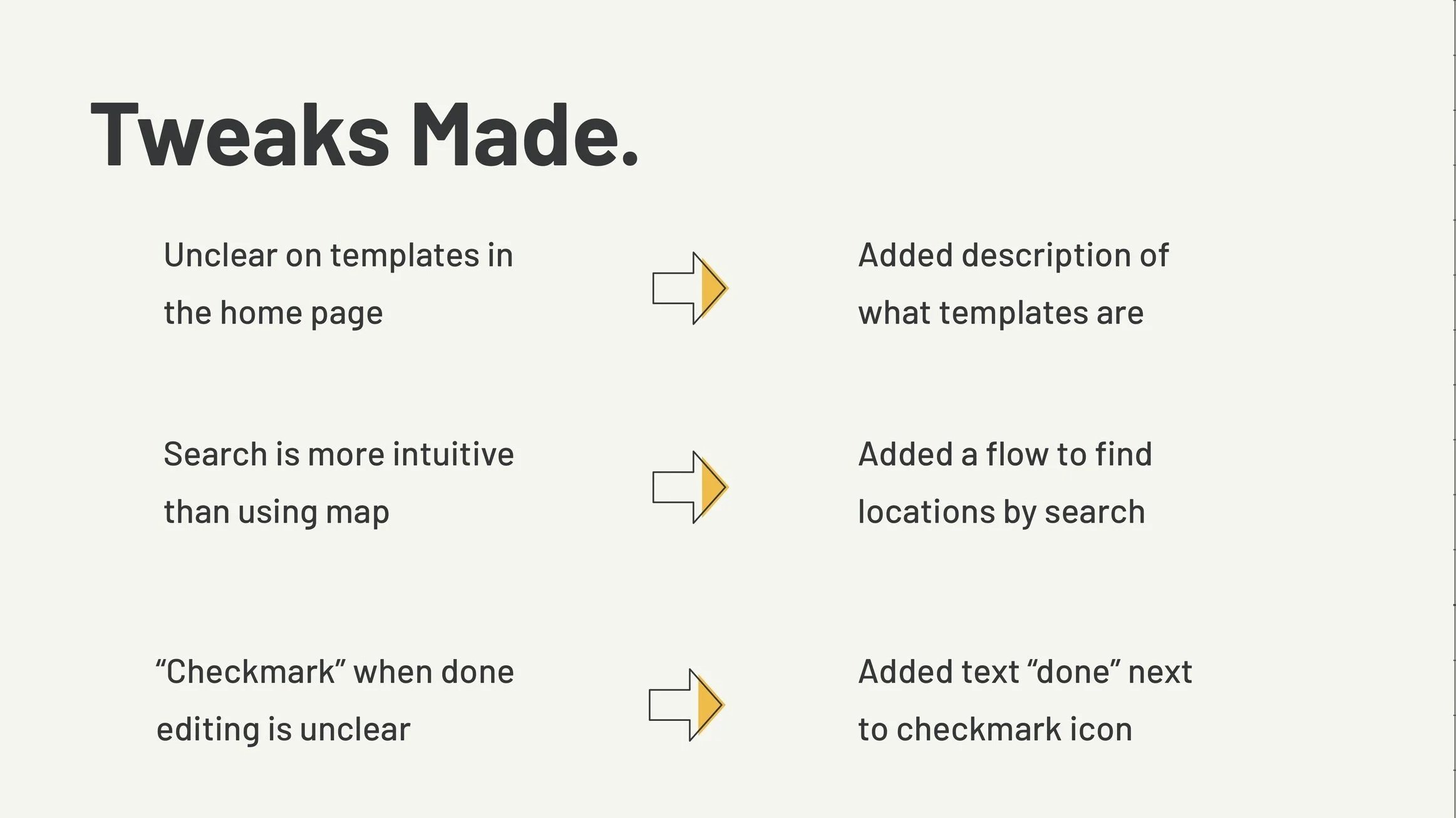
Following unmoderated testing, we found several improvements that had to be made:
adding a description of what templates were, as they were unclear on the home page
adding a flow to find locations by search, instead of using map, which is less intuitive for users
adding the text “done” next to “checkmark” to indicate editing is complete
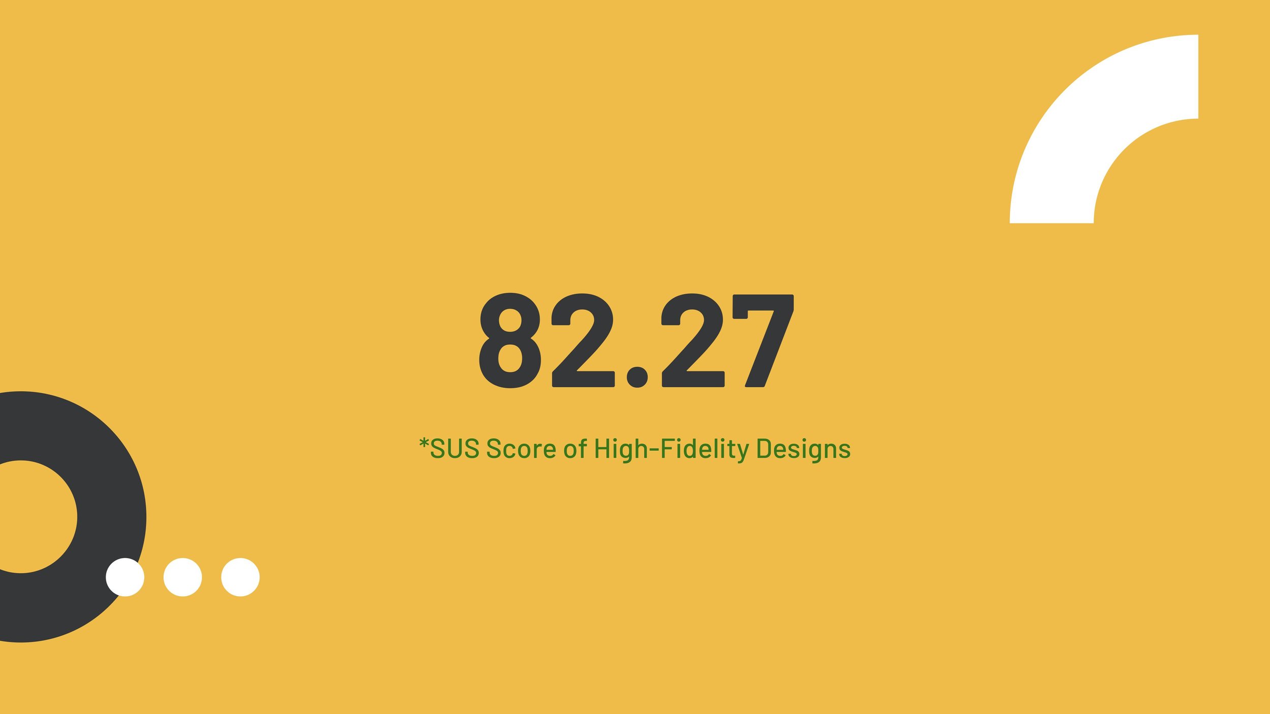
The SUS that was calculated for our Hi-Fi design is 82.27, a clear improvement from our mid-fidelity usability testing.
With all these improvements in mind, we were ready to finalize our design of the application.
Final Prototype
Lessons Learned
We began this project as primarily an app that lets you recreate famous movie scenes based on your location. After talking to people and getting their insights, our app grew into more than just that. It became a template-based application that lets users create beautiful photos and videos.
We learned that simplicity is key: simple, everyday language helps get the message across more easily, and when we must use technical terms (such as “templates”), we need to clearly explain what they mean.
Some limitations with our project exist. These include a lack of a range of participants (due to time and budget); not being able to mimic the real app in the prototype due to technical limitations; and not having enough contributors for user testing to buffer against errors.
Otherwise, this project was incredibly fun to work on, and we each learned something new from each other and the process of collaboration.